PROGRESS
Project Summary
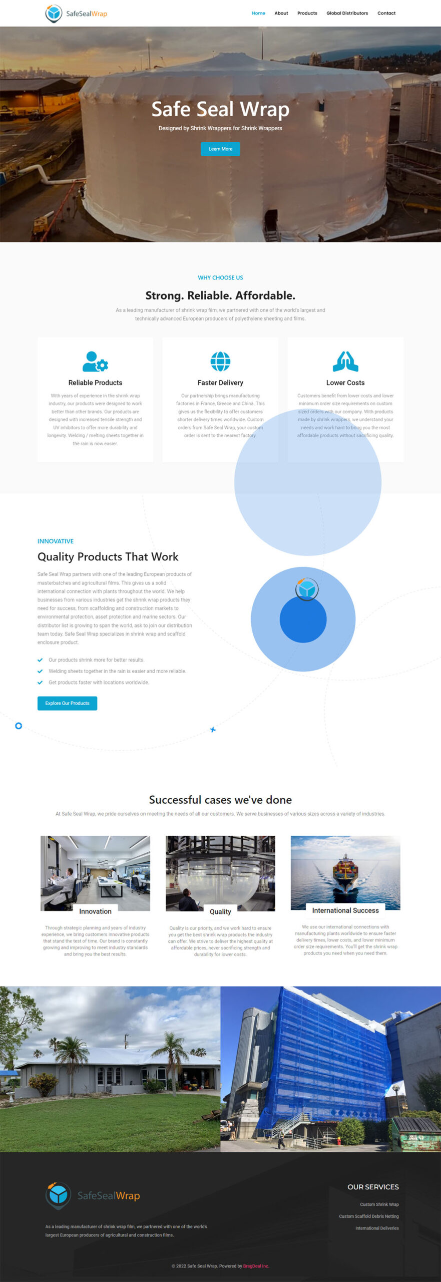
As the original company grew, a new subdivision has been created to separate the businesses. From a new brand, to a website and everything in between, we had to create an online presence that will portray the company’s message.
In order to have a strong and professional brand, we wanted a name that was memorable, self explanatory, and a website that focused on converting users to customers.
THEME WEBSITE SETUP
Strategy & Planning
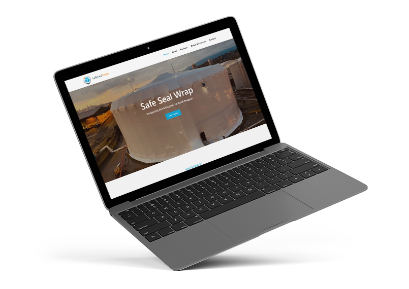
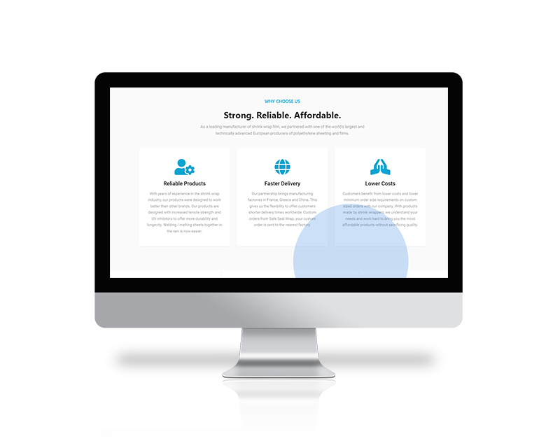
We started researching themes that fit well for the company’s target audience. Our objective was to find a clean, easy to navigate, and informative website to help increase user conversions.
RESPONSIVE LAYOUT
Mobile Friendly Design
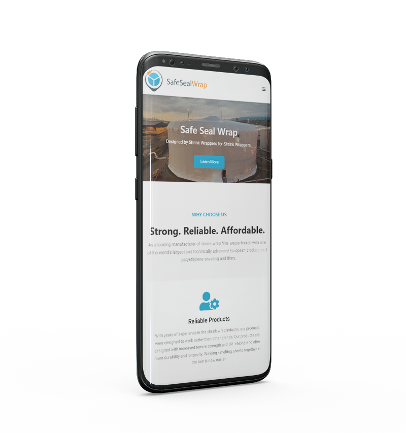
Since most users search the web through their mobile devices, we made sure that each element on the page fit perfectly on both mobile and tablets. Being a website for a wrapping company, the users landing on the page most likely know what they are after. We wanted to make sure those users had a seamless experience navigating through the pages no matter what device they use.
BRAND CREATION
Logo Design
Creating the brand was as fun as it was challenging. The wrapping industry has practically covered all possible names and we wanted something unique, easy to remember, and effective. Safe Seal Wrap was formed after many attempts with play on words, and various combinations. We did all the trademark, business name registration, and general social media checks, and to our surprise, Safe Seal Wrap was in the clear for all!
Combining shapes, working with the “wrap” idea, and many other factors helped form the final symbol concept that completed the logo design process.

Graphic Design
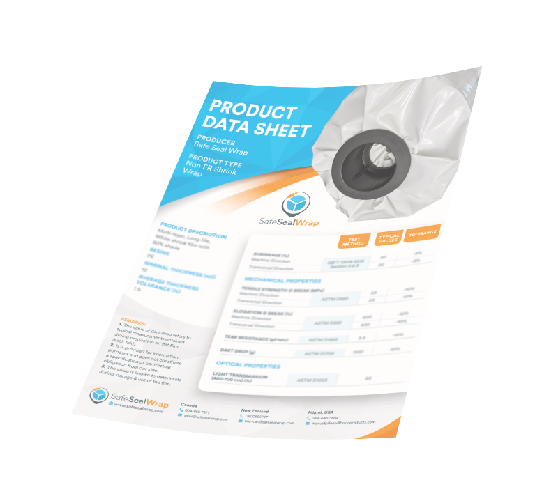
Quotation Sheet Design
Once the brand and website were officially live, it was time for marketing material to help the company grow further. As a professional organization, a uniform, well design quotation / price sheet is important. We ensured that our graphic design maintained a look that felt familiar to the website, and incorporated the branding colours.
FONTS USED
TYPOGRAPHY
Titles Seogoe UI
With clear cuts and very bold font type, Seogoe UI was a perfect fit for titles to help bring contrast between sections.
nav Poppins
Navigation is one of the most important parts of the homepage design so an elegant and easy to read font was selected.
p Roboto
When a user friendly, clean, and professional font is required, Roboto never disappoints. It looks great on all devices due to it’s round and thicker lines.
Palette
COLORS
PRIMARY
SECONDARY
RESULTS
Achievements
The goal of the project was to create the new brand that will capture attention of future potential clients. We’ve created a brand that our client is proud to represent their products with.