The world of website development is ever-changing. It may seem that what is considered effective in web design North Vancouver changes daily. As trends change so frequently, businesses need to enlist the help of a website company who knows how to use the online presence to enhance their brand.
One of the most important elements of your website design is the navigation menu. Website designers continue to adopt new patterns to help businesses effectively deliver important information to their viewers. When a person searches for your products and services, you want them to easily be able to make their way around your website. If they can’t, you may risk losing potential customers.
Let’s take a closer look at the importance of the navigation menu, and the current trends for navigation in web design. When you implement the latest trends for navigation into your web design, you help boost your brand even further towards your business goals.
The Importance of the Navigation Menu in Web Design North Vancouver

Believe it or not, the most creative and trendy website will have no success if it lacks an effective navigation menu. Easy navigation is one of the most important elements of website design. Why? It allows you to give your customers access to the information they are searching for while also encouraging them to further explore your business.
The navigation menu is a collection of links that help bring viewers where they want to go. Your website development company should create a navigation menu that is organized and easy-to-follow. When you use your navigation menu to your advantage, your business will benefit from a better user experience.
Some of the main benefits of effective navigation in web design are:
- Increased visit duration and a decreased bounce rate. When visitors come to your website, you want them to stay for a while. The longer your visitors stay on your website, the more time they spend looking through your business information and exploring what your company has to offer. Bounce rates refer to a measurement of how long visitors stay on your website. When a visitor lands on your website and leaves quickly, without looking around, businesses will display higher bounce rates.
- More Revenue. The easier you make it for your potential customers to navigate through your products and services, the more likely they will be to make a purchase. When you create a website that your customers can effortlessly navigate, you will benefit from an increase in revenue.
- Better Customer Experience. In today’s market, customers want the buying process to be fast. The faster your viewers can access your company information, the more likely they are to do business with you. Clear, concise navigation menus lead to better customer experience.
- Higher Rate of Engagement. From a psychological perspective, the way you deliver your business information to your customers has an effect on their likelihood to engage with your company. Since the navigation bar is at the top of your website, it’s the perfect place to deliver the information you want your users to see. It is a well-known fact that people pay more attention to, and retain, information when it appears at the beginning or end of what they are viewing.
- Better Overall Design. In general, navigation menus affect how viewers feel about your overall design. Organized, uncluttered navigation bars and menus will be visually appealing to your viewers. They are notably more effective. They increase the overall aesthetic appeal of your design and create a better experience for your viewers.
The Hottest Trends in Navigation Menu Design Today
When you create a good navigational experience for your viewers, you unlock a useful strategy that can boost your brand awareness. Navigation trends can really enhance your website design. The most popular navigation menu trends on the web today can be used for a variety of websites, regardless of niche industry and business size. Before you talk about the navigation menu design for your website, make sure your website development company creates a responsive design.
These trends are effective across the board for any type of business using a responsive website. Here’s a look at the latest navigation trends that look like they’ll be sticking around in 2019.
1. Sticky Navigation Bars
This trend is quickly becoming a staple on websites across the internet. It’s called a “sticky” navigation bar because it sticks to the top of the page, even as users scroll down through your content. This allows viewers to continue to see the navigation bar while they explore your website.
Users can navigate to other pages on your website without having to scroll back up to the top or bottom of your page to make their way to other pages. Thanks to CSS and jQuery plugins, many new themes come with the sticky navigation bar as a default. Since it is a great asset to mobile users, it’s apparent that this trend is here to “stick.”
Real-Life Implementation Example: US Magazine
2. Mega Menus

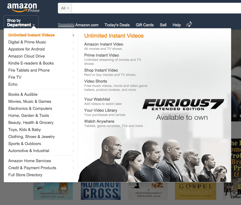
The mega menu became increasingly popular as more and more magazine-style blogs began to emerge in the last several years The mega menu navigation menu gives you a wider expansion of your drop-down options. With the ability to include multiple columns of content, these are a great option for websites with a larger number of pages.
While this isn’t a great option for every site, it is a major asset to websites hoping to give customers a quick snapshot of larger amounts of information available to viewers. Rather than using a vertical menu that can become lengthy to scroll through with lots of content, the mega menu provides a wider view of your menu options.
Real-Life Implementation Example: Amazon
3. Universal Navigation
If you work with or own multiple brands under one parent company, universal navigation may be the right fit for your website. As the name suggests, universal navigation menus allow you to keep the same navigation bar on every page, regardless of your brand.
It’s a great way to draw attention to your other businesses, or the other products you offer in your other brands. Linking your different products or brands can be helpful in building brand awareness and identity. Plus, the universal navigation can bring new leads to other areas of your business.
Real-Life Implementation Example: Disney
4. Globally Hidden Menus

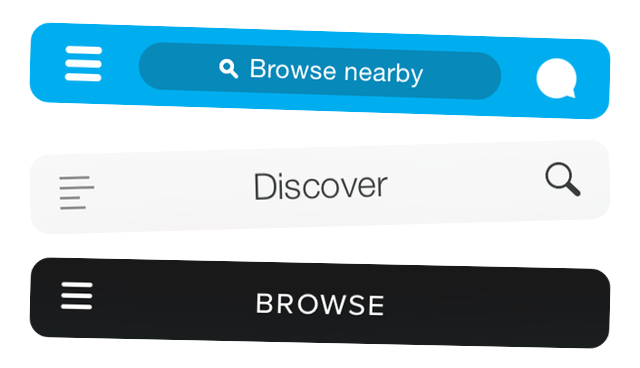
A quality web design company knows about the use of hamburger icons in responsive design. When it comes to navigation, this means businesses can hide the actual menu from their viewers. But, why would they want to do that?
Although it might seem like a strange tactic, globally hidden menus clear up screen space to allow for viewing of other information. While some users may struggle with understanding this menu, smartphone users are getting more familiar with the significance of the hamburger icon.
Real-Life Implementation Example: Spotify
5. Responsive Sub-Navigation Menus
Mobile navigation is another important aspect of your design. The use of mobile devices for online searching and purchasing will only continue to increase as the years go on. Today, there is no way around responsive design. Even Google implements it as a requirement for its industry standards in SEO.
To meet the new requirements in responsive design, many businesses are implementing the use of drop-down menus into their navigation bars. Sub-menus are accompanied by an icon, color change, or visual marker that visitors must click to bring up further navigation options. It’s a great way to deliver the most popular content to your viewers while allowing them to dig deeper if they choose.
Real-Life Implementation Example: Entrepreneur
6. Top Story Carousels
This is a popular trend in high-volume news sites and blogs. As some websites publish dozens of articles every day, visitors are awarded the chance to check out the latest publications through a simple carousel at the top of the page. For websites delivering high-volumes of content, this is particularly effective. Visitors can easily scroll through the most recent stories, right at the top of your page. This type of navigation encourages users to further explore your website, and maybe even read an article or two that they wouldn’t have with traditional navigation.
Real-Life Implementation Example: PopSugar
7. Table of Contents
Table of contents navigation is a great way to improve the user experience for websites that deliver longer articles or content. As more and more writers publish long-form content, the table of contents is an easier way to help your viewers get the information they need when they need it. Table of contents navigation allows your audience to jump to highlighted sections of your content, saving them time if they are looking for specific information within your content.
Real-Life Implementation Example: Wikipedia
8. Dot Navigation
As single-page websites become more popular, dot navigation is a growing trend in the IT world. Through the use of circular icons, users can toggle between different sections of the site on the right or left of the screen. Each dot represents a different section of the website. Since one-page designs can be lengthy to rifle through the content, the dots help you move quickly to the next section. They also give you an indication of where you are on the website.
Real-Life Implementation Example: Kvell
9. All Caps Corner Links
This navigation trend is subtler than most, but it is just as effective. From startups to professional, larger-scale businesses, the use of the all-caps navigation style is both captivating and symmetrical. This design trend is clean, crisp, and attractive to viewers. Psychologically, it creates a sense of trust amongst your viewers.
Real-Life Implementation Example: Mammoth Media
If you hadn’t put much thought into your navigation menu or bar, you probably have by now. There are so many elements that go into effective website design. While it may seem overwhelming at first, don’t panic! Enlist the services of a website development company who implements all the latest trends in website design. They’ll help you navigate the world of web design…literally!


