While building a website, curating the best user experience (UX), perfecting your brand, and reaching out to your target audience you will undoubtedly come across endless advice and resource on what to include in your web design. You’ll come across style and layout tips, hacks on how to get free marketing, why to include a blog, and which website building platform is the best. These are all extremely useful things to consider when creating the best website possible, however, something else to consider is what you should avoid. Certain corners seem worth cutting and adding certain elements may seem like a good idea, however, websites need to be both simple and effective. You want to edit in the right places and spend a lot of time in others to strike the perfect balance. Below are 10 things to avoid having on your website to better your business.
1. Avoid lax security

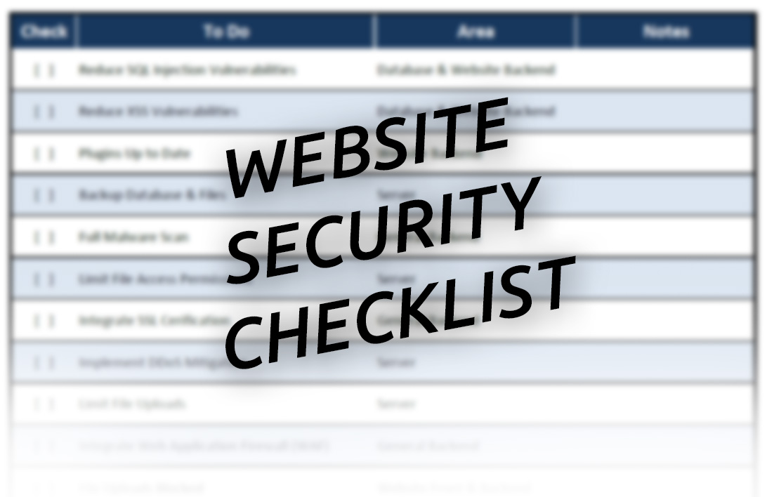
As a business owner, or even just someone with a website, you want to make sure whoever visits your site is safe being there. Having an SSL certificate ensures the safety of your clients and customers. This is especially important for companies that request personal information such as an email or any online payment. You are responsible for what happens on your site, make sure it’s secure! If you are visiting sites and wondering if they are secure, a quick way to tell is their address bar will read “https” as opposed to “http”.
2. Limit Pop-ups
Although pop-ups have their place in web design, a good rule of thumb for using them is less is more! Pop-ups can derail a browsing session, affect a good UX, and even cause someone to leave your website. One pop-up to consider using is the landing page pop-up, it forces users to interact with the pop-up before accessing the rest of the website, and often offers customers access to exclusive content, promotions, or otherwise tells them about sales and new products and services.
3. Avoid vague search tools

Make sure to have well-defined headers and other search tools on your website, especially if you have a lot of content. Landing on a website and immediately having trouble accessing the information you’re looking for is something to avoid at all costs. When building your website, include what you would want to see if you were a client. If your business is service-based, make sure services are visible within seconds of being on the page. If you are selling products consider having a search box to help guide customers quickly to where they want to be.
4. To build the best website, don’t have outdated content
If you want to have the best website possible you have to keep it current and up-to-date. This is important for content on it such as the language you use, marketing tools, and blogs, but also basic information on your site. Store hours, contact information, address, phone number, locations, prices, products, and services must always be accurate. Having outdated information on your website discredits your business and is frustrating for customers and clients who are viewing your page to potentially work with you and give you their business.
5. Avoid cluttered design

We’ve said it once and we’ll say it again, simple is best! Cluttered web design, too many features, and an excessive number of pages is confusing for the person using your website. You want to create a positive experience for your visitors while directing their eye to important features. You’ll want to include images or graphics, words, and click-through-links, however, they need to be skillfully placed, and not in competition with other elements on the page. Each section of each page should have a clear message and action to take.
6. Confusing navigation has to go
This goes alongside cluttered pages. Similarly, to how you want the message of each page clear, you want the route through your website clear and easy to follow. Take advantage of footer and header navigation bars, as well as intuitive homepages. Your most important pages should be the first thing clients see, and everything else on your site should be easy to find and re-find. Getting lost on a website is just as bad as getting lost in an in-person store.
7. No click-through links

Links that help guide the user are crucial for a good UX. Be sure to include well-defined call-to-action links such as “call now” or “get in touch” or “learn more”. By not including links like this, you prevent your future customers from taking the next step to doing business with you. You want to make sure getting in touch, buying your product, and soliciting your services is as easy as possible. Simplicity in accessing services is a make-or-break when it comes to business. You can have the best product in the world but if your customers can’t easily access it, they will opt for something else. Another click-through link to include in abundance on your website is a “contact” link. You always want your customers aware that they can get in touch and that you are available to them. One reason people prefer in-person to online is the ease at getting their questions answered, make your online platform a place that’s ready and available to reach out to customers.
8. Poor conversion to mobile phones
Most of us use our mobile phones more than our computers, especially when it comes to searching for things online. A bad screen resolution, a non-functional mobile layout, or a confusing mobile conversation are all things that affect the overall usability of your website. When you set out to design the best website around, consider your mobile website at the same time.
9. Eliminate website laggers

Let’s face it, no one likes a slow website. Things to avoid or that are worth monitoring are, large media files and visuals, bulky, confusing, or conflicting code, and too many plug-ins,
10. Avoid extra-long pages
We told you we’d say it again, less is more! When it’s appropriate, keep your content short and sweet. Don’t omit or eliminate valuable information, but don’t bombard your customers with lengthy paragraphs and extra-long pages. Building a website is really about finding that sweet spot of just enough. You want your visitors to feel complete and well-informed by your website but not overwhelmed or bored. Keeping your pages short and sweet helps with UX and encouraged users to visit other pages and stay on your website. Have you ever gone to read a blog and then looked at the scroll bar, noticed how tiny it was, and left because you didn’t want to commit to reading something so long? Well, if you’ve experienced this, chances are your customers have to. Don’t discourage people before they get to know your company! Complete and concise website pages are always the way to go.
Good luck with building your website! Have a look around at some of your favorite companies and website and ask yourself, “what do I like about this site?” and use that as a template for your vision. If you need a little extra help bringing your perfect website to life, Vancouver’s best web design agencies specialize in making your vision come to fruition with in-depth research on your competition, your niche, and your target audience. Your website is often the first thing new clients will see, make sure you’re giving them the best web design possible.


