An exceptional website user experience is the best way to engage viewers and increase conversions. Although it doesn’t need to be a complicated process, you must take several crucial steps to ensure a quality user experience.
Since most business owners don’t know where to start when improving their website, this article offers the best tips to improve your website user experience. A better user experience leads to increased conversion rates, a better brand reputation, and record business growth. Let’s discuss the steps you’ll need to take to make it all happen.
1. Improve Website Loading Speeds

One of the most important steps to take to improve your website’s user experience is to improve loading speed. A professional web design company in Vancouver can easily make this happen. If your site takes too long to load, your visitors will quickly lose interest and move on before they even engage with your content.
Since you don’t want to lose viewers over something that can easily be controlled, you’ll want to monitor loading speed and address issues immediately. One easy way to do this is to choose a light website theme that doesn’t slow down your loading times and ensures your site is responsive for all users. This also helps improve the user experience with features such as easy navigation and clear call-to-action buttons.
Keeping things light and responsive also ensures your website is clean, organized, and clutter-free. This ultimately has a positive impact on website user experience. Responsive web design is a crucial step in your overall user experience and your SEO results. If you’d like to know more about how to make your website more responsive, check out our guide detailing why your business should use responsive web design in Vancouver.
2. Use a Preloader Image

Using a preloader image can make a huge difference in improving the website user experience. It also helps distract users from noticing longer wait times. A preloader is an image displayed on your screen while your website loads, as seen in the example above. It ensures that visitors have a visual distraction that keeps them engaged while your website loads, which is particularly important if site loading speeds are slower than usual.
Preloader images also add a professional feel to your website and show you care about your business by investing in the small details. This is important in increasing conversions. A reputable graphic design agency can help create a branded preloader image that further enhances the user experience. To learn more, check out this handy guide we’ve created that covers everything you need to know about how to add a preloader to WordPress.
3. Ensure Your Website is Mobile-Friendly

Today, around 80% of internet users own a smartphone and typically spend an average of 2.8 hours a day online. Many of those users will browse your website on their mobile devices. Therefore, your overall website audience is comprised of a significant number of mobile users. Mobile user penetration (the number of smartphone users who browse the internet with their devices) was 48.8% in 2014 and increased to 61.2% in 2018, according to Statista.com. This number is continuing to trend rapidly upwards, with rates reaching 78.05% at the start of 2020.
This being said, tailoring your website to mobile users is extremely important and will open you up to many more visitors. This doesn’t just improve conversion rates, but it also decreases your bounce rate. If your website provides a streamlined mobile user experience, you will put yourself well ahead of many of your competitors. A mobile-friendly website can increase your reach in a big way. Without a responsive design, you will miss out on significant website traffic and your conversions will suffer as a result.
We have a full article that covers just how crucial a mobile-friendly website is and covers the ins and outs of how responsive mobile design increases conversion rates. As the leading Vancouver web design agency, BragDeal can help you create a mobile-responsive design that brings more value to your business. Reach out to us to discuss!
4. Use an Easy-to-Read Font Size and Effective Line Spacing

You’ll want to invest in crafting effective and engaging website content, but you won’t deliver your message efficiently without the right design. Visitors need to be able to read and absorb your content and enhancing readability dramatically improves the user experience of your website. It will also make your site easier to navigate, especially for those with accessibility issues. If your users have to struggle to read your text, they’ll become easily frustrated and move on from your website. This inevitably leads them to turn to your competitors for what they need.
An easy way to improve readability is to ensure your text is large enough for everyone to read. This has the added advantage of allowing you to clearly display your overall message. It is crucial to find the right balance here. While you don’t want your text to be too small, you also don’t want your text to be too large. Failing to create a balance between the two will have a negative impact on the overall user experience.
5. Create a Custom Homepage (and/or Landing Page)
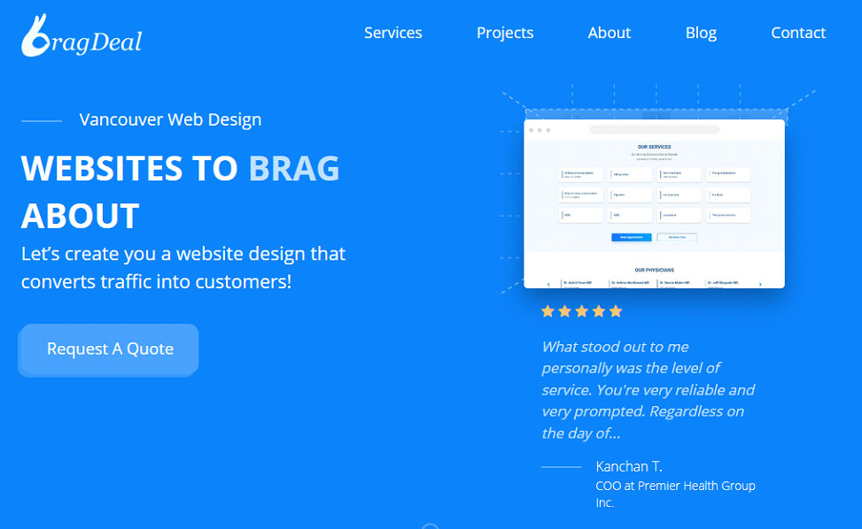
Making your website stand out in a positive way is the best way to get ahead of your competition. Building a custom homepage is one way to achieve this goal. Your landing page and/or homepage are the first pages visitors see when they navigate to your website. We suggest paying extra attention to both of them. Doing so will help you show off your unique style and ultimately stand out from your competition.
Finding a professional web design company isn’t overly complicated, but can be challenging if you don’t know what to look for. We’ve put together a list of 13 tips to hire the best web design agency for your business to help you make the right choice for your business.
6. Improve Site Navigation
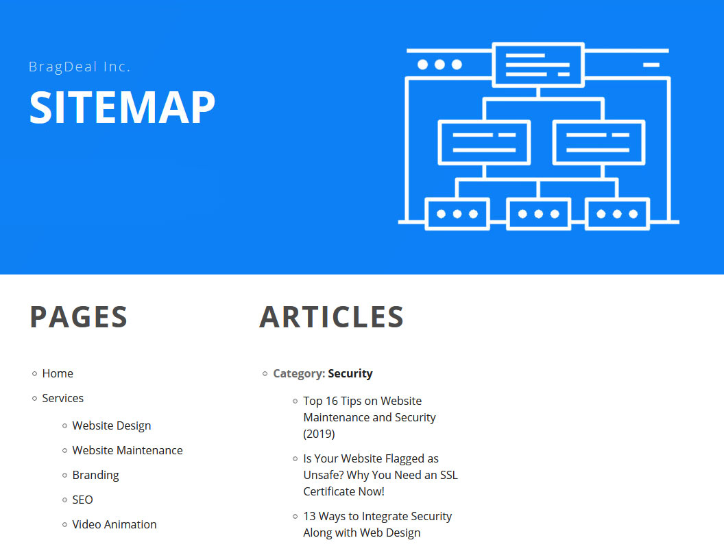
When it comes to website usability, simplicity is vital regarding website navigation. Your navigation menus should not be overly complicated. Streamlining them can make for a massive improvement overall. Using too many drop-down menus is one issue you should avoid. If users have to struggle to make sense of your navigation aids, it negatively impacts the user experience and lowers conversion rates. Both of these are issues that dramatically impact your overall business success.
7. Create Conversion Goals

Discuss conversion goals with your website design team. On top of cleaning up navigation clutter, they can help you direct visitors from your homepage to your conversion goals in a few, simple clicks. The name of the game here is speed and efficiency. If users spend too much time bouncing around on your website, they can easily lose interest. This makes them less likely to convert in a reasonable time frame.
While you want to keep your website interesting and captivating, you also want to minimize useless wandering as it can impact bounce rates, conversions, and other website metrics. There is nothing worse than losing conversions from issues that can easily be rectified with simple website improvements. Keeping things simple is always the best practice with website design. Doing this will work wonders when it comes to increasing conversions and improving the user experience.
8. Clean Up Your Sidebar (or Remove It Entirely)

A sidebar can be a useful tool, especially when it comes to driving conversions and improving navigation. Even so, if it seems forced (or is too busy) it can detract from your website’s overall aesthetic. If you do include a sidebar, it should be minimalist in design and function to avoid drawing attention away from the rest of your site.
Additionally, you should definitely include click-tracking scripts for each element included in your sidebar. This helps you determine just how effective each one really is. A poorly-designed sidebar can negatively impact the overall feel of your website and page design. If a sidebar is too bulky, it can make the rest of your website look lopsided and uneven. Most web design companies in Canada will tell you that a sidebar isn’t necessary, but it depends on your personal preference. If you want to include one, try to make it feel both straightforward and professional.
9. Add More White Space (but Not Too Much) to Decrease Site ‘Density’

Effective use of white space can drastically improve the look and feel of your website. Too much white space can negatively impact your site and take away from your overall user experience. On the other hand, too little white space will increase the density of your website. This will make it harder to navigate visually and distinguish between separate page elements.
Consider using more white space if website elements seem like they’re packed together too tightly. When you pay attention to proper spacing, your users will better appreciate how your website looks. This, in turn, will make them more apt to follow through on your conversion goal.
10. Select a Colour Palette that Isn’t Too Busy

Most designers suggest using two to three main colours when choosing your colour palette. If you opt to use more colours for highlights, a good rule of thumb is to use two main colours and only a few secondary colours toned to fit your primary colours.
Anything more than this is typically too distracting to your visitors. On the other hand, a single colour will make your website seem too bland or boring. Furthermore, your text doesn’t have to be flat black. Many website designers opt to use dark gray tones for paragraph text. Graphic design companies in Canada know how to put together the perfect colour palette for your website. A clean colour scheme will maximize results and provide a sleek, professional look.
Understanding the psychology of colour is a great way to attract viewers. It does, however, involve significant planning to ensure it’s properly executed. To help simplify things for you, we have a handy guide that addresses how to use web design to attract customers through the psychology of colour.
11. Use a Consistent Design and Layout for All Site Pages
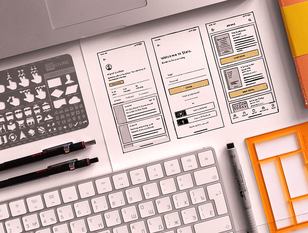
When designing your pages, make sure all of your pages fit the same aesthetic as your homepage. Consistency between pages is important; it will help make navigation feel more natural as visitors move through your website. This improves user experience in a big way, eliminating distractions and streamlining your site.
12. Improve Your Call-to-Action Messages and Images

First impressions are incredibly important in all aspects of business. Regarding sales, the first sixty seconds is crucial. If you take any longer than that to engage your viewer, you’ve probably already lost their interest. This is detrimental to improving conversion rates. Since most viewers decide whether to invest in your business within seconds of arriving at your website, you’ll want to make create an engaging experience to impress your audience.
Any call-to-action buttons and content are incredibly important. CTAs should include a few key elements at the very least – the first one is an engaging design. Whether designing a creative button or adding high-resolution images, effective visuals enhance CTA clicks.
Secondly, your headlines should be kept simple, short, and to the point. Although this can be easier said than done in many cases, your website team can help you create a call-to-action that converts. Using a ‘feature box’ or contrasting colours to highlight your call-to-action messages are also effective tactics. Additionally, using power words and action verbs will have an impressive impact.
13. Ensure Primary Call-to-Action Buttons Stand Out

Alongside design, content and colours, you should make sure your CTAs stand out. A feature box helps achieve this goal, as does implementing a pop-up box. Pop-ups can be set to appear after a certain amount of time has elapsed. They can also be set to show up after a user performs a specific action, such as navigating to or from a given page on your website.
This is one of the few times when you may want to use a different set of colours that really stand out. Doing this will ensure that the user’s eye is drawn right to your call-to-action element. It also prevents your CTAs from blending into the rest of your site. Colours that are attention-grabbing, like green or red, are perfect choices when it comes to your call-to-action button.
14. Limit Pop-Ups and Other Distracting Page Elements
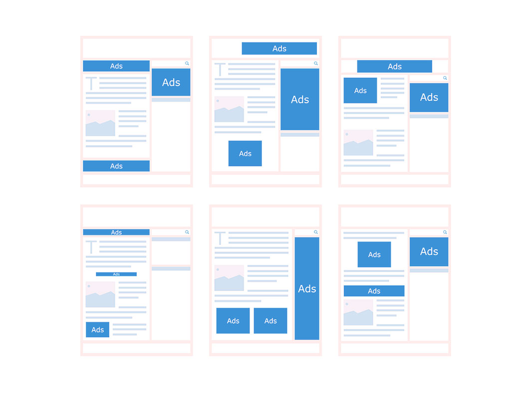
Another way to improve the user experience and your call-to-action button stand out is to avoid adding too many other pop-ups on your website. Unnecessary pop-ups don’t just distract your visitors, but they can also create a sense of frustration. When used too often, pop-ups can be incredibly annoying, especially if a user knows what they want and is interrupted from taking action because of pop-ups. Overusing them makes people less likely to interpret your message or view your offers seriously. They’ll also be less likely to revisit your site in the future.
15. Include an ‘About’ Page with a Picture of Yourself or Your Product
Adding an ‘about’ page that also includes a photo of yourself humanizes your brand and makes users feel like they know you better. This is a vital component of creating a personal connection with your audience. Your ‘about’ page is also the perfect opportunity to show off your business and highlight the positive impact of investing in your brand.
An ‘about’ page allows your visitors to get to know a little more about you, what you do, and what you have to offer. Including an ‘about’ page will always increase the overall website user experience. It also creates a sense of trust in your brand. When your visitors can get a better sense of who you are and what you’re all about, you will end up with more conversions in the long run.
16. Avoid Using Irrelevant or Unnecessary Links and Banners
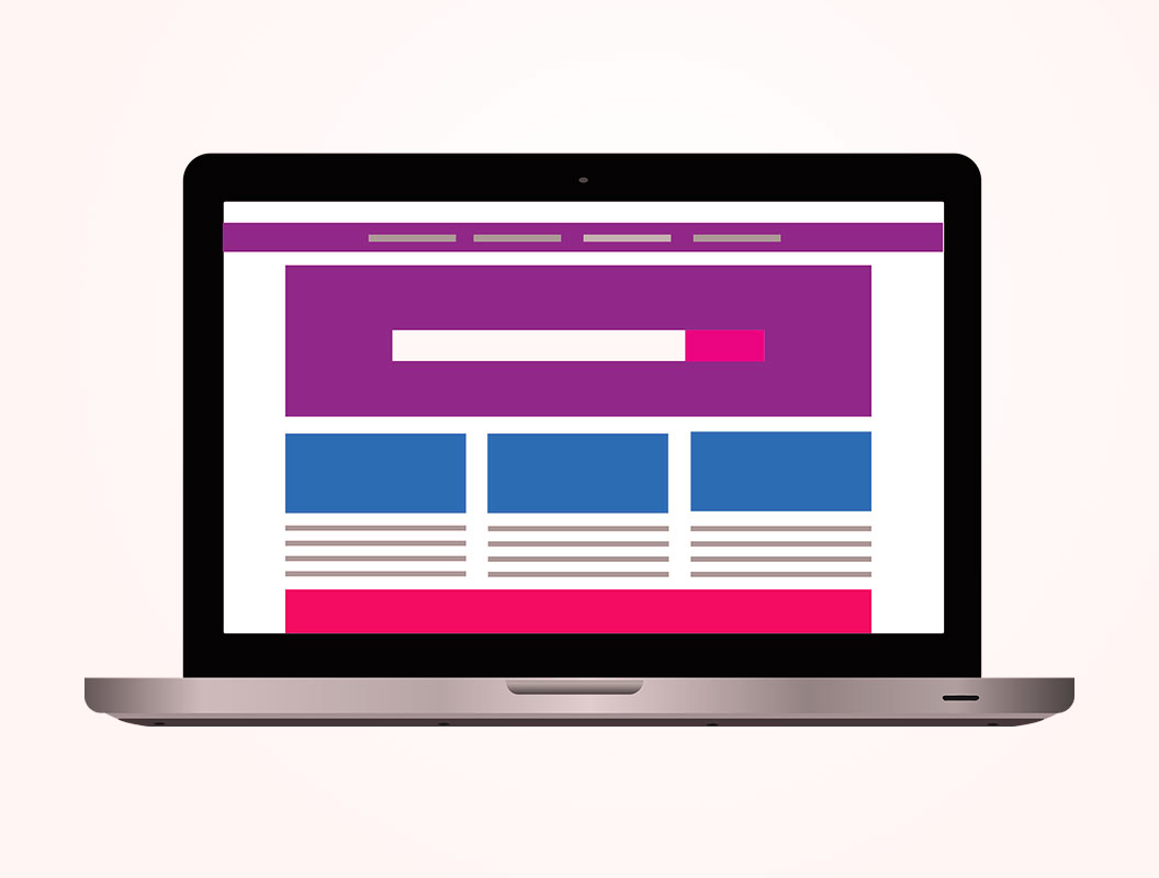
Cognitive overload is a big issue with poor user experience. Clearing any unnecessary obstacles that distract users from your conversion goal is essential. Therefore, avoid using flashy banners. Making sure that banners don’t take up too much space on your website’s pages can have an overwhelmingly positive impact on your conversion rate.
Irrelevant links can also pose a problem, especially those that lead to external sites. Internal links are incredibly valuable if they are used properly, but external links only serve to direct your users away from your own website. Unless they hold significant value to your viewers, it’s not advised to use them frequently. It all comes down to ensuring that your users aren’t overwhelmed or confused when navigating through your site.
You want to keep users on your site and direct them toward your conversion goal – not away from it. If users need to stop to sort through too many options available to them, they will become easily distracted. This makes them feel less connected to your website and your business. Immersion is important, as is avoiding cognitive overload. When you avoid using unnecessary and distracting elements, it will undoubtedly have a positive impact on website user experience and conversion rates.
17. Create Engaging Content that Speaks Directly to Your Users

One of the best ways to increase user engagement is to speak directly to your audience. Use words such as ‘you’ and ‘your’, while avoiding the use of ‘I’. Using the word ‘I’ can make viewers feel that they are being talked at instead of included in the conversation. Talking to your audience instead of telling them what you do is a powerful linguistic tool. It also takes very little work to apply this tactic in a meaningful way. Speaking directly to your users helps make them feel like you care about them.
Another solid way of increasing both website user experience and conversions is to use power words and action verbs. If you don’t include these, people tend to simply skim through your content instead of taking the time to carefully read through it. Power words seem to jump off the page more readily, which is key. They also let readers know you have the right skills and qualifications for the job at hand.
Power words, especially action verbs like ‘accomplished’, ‘initiated, or ‘designed’, help liven your content. Using terminology that is less repetitive will also set you apart from the competition. Choose words that come across as more thoughtful and appropriate to increase engagement. Power words can also include keywords, industry buzzwords, and ‘skill’ words that show you have the business qualities your users are looking for.
18. Improve Your ‘Above the Fold’ Sections on Each Page

‘Above the fold’ sections are those located in the top half of a page. The term was coined by newspapers and tabloids and refers to the top half of their front pages, where their most meaningful content is placed. This gives above-the-fold content a greater chance of being noticed and read, thereby engaging their immediate attention. This, in turn, leads to increased sales.
The same practice helps drive conversions online by ensuring that your site prioritizes its most meaningful content. When you pay extra attention to above-the-fold content, your website visitors will be more inclined to continue scrolling down. This helps you keep their attention longer and increases conversions. It also improves website user experience by making them care more deeply about your content as they continue to scroll down.
19. Simplify and Streamline Your Initial Opt-In Process

Your website opt-in asks your users to give you their information, usually in the form of an email address. This process allows users to sign up to receive a newsletter, mailing list, or future advertising content. The most effective opt-in strategy is to keep it simple. When users are presented with long, drawn-out forms, they are less likely to engage. Instead, keep it simple and only require the basic, essential information such as name and email address.
Once a user has signed up for the initial opt-in process, you will have an easier time getting them to follow through with a more extensive opt-in at a later stage. This is usually accomplished by sending them an email to thank them for their time and attention and including a link to confirm that they did, in fact, agree to opt in.
Making your opt-in simple allows users to share their information even if they’re short on time. They can then refer back to your confirmation email at a later date to continue the process in a more relaxed manner. If users can easily start the process without having to fill out a more complicated form right off the bat, you will see more conversions in the long run.
If you’d like to know more about email marketing, we have a handy guide that covers best practices for your email marketing strategies, along with how to go about collecting emails for better SEO on your website.
20. Create Offers that Complement Your Business

Nothing can seem more disingenuous than offering products or services that don’t actually relate to what your business is all about. When you make a point of ensuring that your offers align with your business and its overall purpose, you’re much more likely to increase conversion rates. Additionally, you should try to highlight exactly why you’re the best choice for your users.
21. Update Your Site Frequently with Quality, Relevant Website Content

One of the cornerstones of basic SEO and a solid website user experience is to offer quality, relevant content. This relates to every piece of written content featured on your website, along with your blog posts or articles. When you take the time to ensure your content is top-notch, you show that you know what you’re doing and you’re invested in your audience. Additionally, you prove to them that you’re able to provide the same quality when it comes to your products and services. This makes users more apt to opt in and leads to increased conversions for your business.
22. Use Split-Testing on Pages and Elements
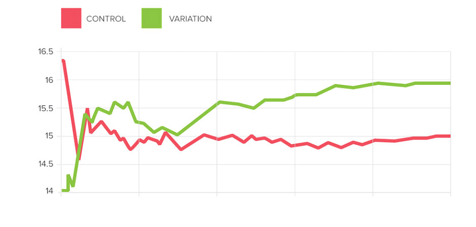
Also referred to as A/B testing (or multivariate testing), split testing uses controlled ‘experiments’ to improve click rates and reduce bounce rates. When applied in a meaningful way, it will increase conversions. It also gives you a better sense of what elements work, and which don’t work or require additional tweaking. When applied correctly, split testing mixes incoming traffic between your original website and alternate variations without users realizing it.
Monitoring differences in website user engagement between these variations gives you a useful way to gauge what version works best for your intended goals and your target audience. You can then effectively optimize your website user experience. Removing elements that don’t work and focusing on those that work best makes your site more enjoyable and engaging for your website visitors. This will also increase your conversion rate in a big way.
23. Use Relevant Images and Avoid Using Overly Generic Stock Photos

This one should be a given, but it’s still worth mentioning. Overly generic stock photos are fairly easy for viewers to recognize. When you use them, people will be less likely to trust your products and services. That’s not good for any online business. Instead of stock photos, consider spending a little more time taking your own photos or creating custom graphics. Any images that you include should have a clear function and purpose.
Likewise, using purely decorative photos can be detrimental to your website user experience and conversion rates. Most people will simply ignore them. Decorative photos can also overwhelm or distract users from your brand message. As with all UI elements, you should test photos ahead of time to ensure they help to clearly support your website’s message.
Furthermore, you should always use high-resolution images that aren’t blurry or pixelated. Optimizing all photos on your website is an effective way to increase engagement and ensure user satisfaction. Images should also be free of any distortion, with an aspect ratio that fits their final sizing. If you must use stock photos, they should represent the point or message you’re trying to convey. Including captions for people with visual impairments also makes your website more user-friendly.
24. Add Videos or Infographics Instead of Static Images or Text
A recent study conducted by Eyeviewdigital.com found that using videos can increase conversions by up to 80%. This makes videos an incredibly useful tool for improving website user experience. For starters, videos increase the length of time that your users stay on your page.
This helps give you extra time to convey and sell your message. Including yourself or a team member in your videos also increases the sense of trust users have in your brand. Today, online users ingest information from videos at a rapid rate. They also prefer to watch videos over reading content because it’s easier and less time-consuming.
25. Use Various Element to Diversify How Content is Presented
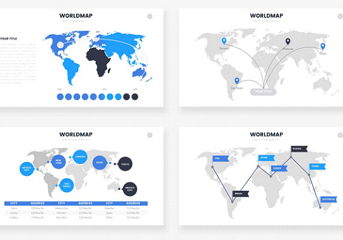
Including a variety of elements when displaying content is really important in increasing website user engagement. Break up text with images, graphs, charts, infographics, slideshows, and videos. You will see immediate and positive results when you do this. Including a mix of elements also helps you engage with a much broader audience.
Infographics are a great way to include all of the above elements in one convenient place. Sticking with just infographics, however, limits user engagement. Make sure you use these elements in a way that makes sense and fits your message. If you can find a relevant way to fit them in, it’s well worth doing so. Breaking up content also keeps things interesting, thus maintaining user engagement longer. This lets you get your message across in a unique and more inviting way.
26. Create a Simple and Easy Contact Method

Your website visitors will always appreciate having an easy way to contact you if they have any questions. While a FAQ section is always useful, being able to contact you personally will make your users trust you more readily. Therefore, your contact page should be easy to find, understand, and navigate.
Your contact section should also include multiple ways for users to get in touch, including your address, phone number, and email address. Having a well-rounded contact method selection is one of the easiest ways to drive engagement. It will also vastly improve your website user experience. You should include links to your contact page in your main navigation menu, at the very least.
Any valued web design agency will suggest you include a link to your contact page in the footer. This allows users to find out how to contact you easily without having to struggle to find your contact information at any point. You’ll also want to consider using a contact form to gather information. Be sure to work with a professional web design agency to create a contact form that is secure and doesn’t attract spam or malware.
27. Include Testimonials and Reviews
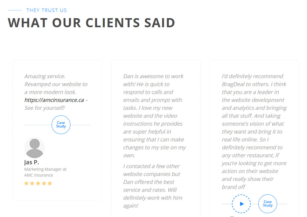
Testimonials and reviews from previous customers are vital to your future success. When website visitors can read about the positive experience of other customers working with your business, they are much more willing to take a chance on you. It doesn’t take much to feature these on your website and a little goes a long way with testimonials.
Effectively displaying your testimonials and reviews is important. Make a point to include them in a place that’s easy for users to find organically. They shouldn’t take up a lot of space on your page and it’s not difficult to fit them in without distracting users from other important content. People can find it hard to trust a business if they don’t have a proven track record of client success. Testimonials show users that you bring value to your clients.
28. Use Relevant Numbers

Nothing helps boost your conversions like showing off just how many people you’ve impressed and satisfied so far. Showing off relevant numbers, like the number of successful projects you’ve completed or the number of subscribers you currently have, is the perfect way to prove that you have what it takes to do the job at hand. Showing off relevant numbers also gives your visitors a sense of being part of a larger community.
People always want to feel like they’re a part of something bigger than just themselves. The best way to include your users in something that they can be proud of is by boasting about how many successful conversions you’ve achieved. This also makes your current customers feel like they actually matter, which will help maintain interest while keeping them coming back for more.
29. Include Descriptions of Awards, Brand Features, and Publications
Another amazing way to showcase your brand and your exceptional services is to include a section that highlights places where you and your work have been featured or published. This is a great way to highlight what you do and increases the trust your users have in you. When users can see exactly how successful you are, you can increase your conversions in a big way. This also keeps people more interested in everything you have to offer.
30. Proudly Display Featured Posts
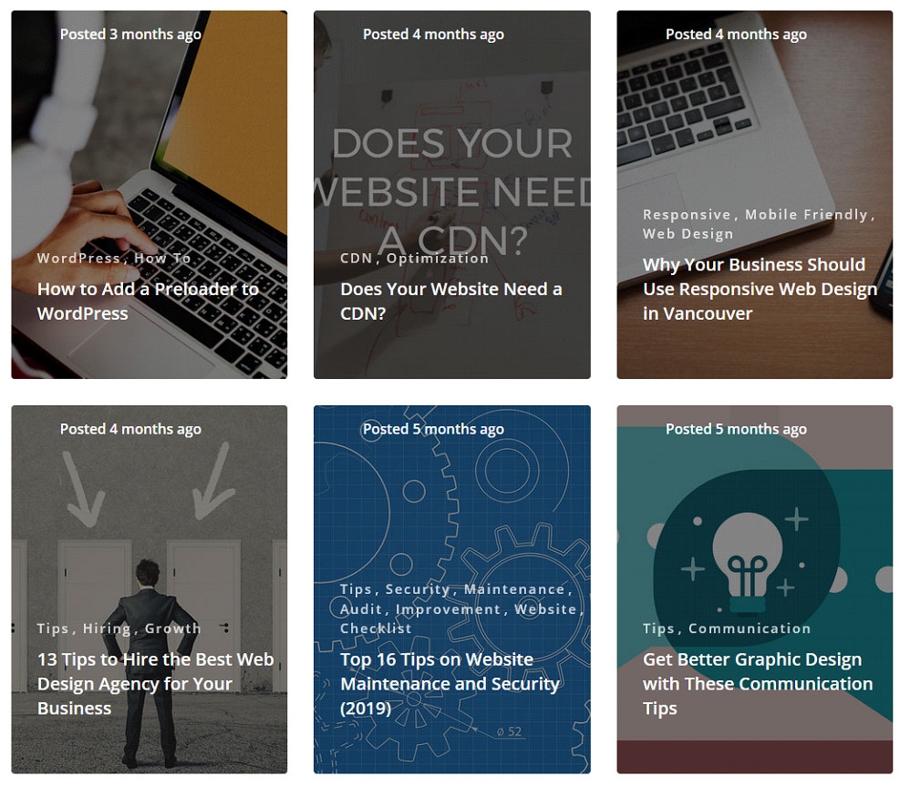
Featured posts are important and you should always try to show off your best work. Blog posts or articles that have received a lot of attention in the past are perfect to display. When you showcase your accomplishments and are proud of the work you have done, your website visitors will feel a sense of authority.
This gives you the perfect avenue to increase engagement for all of your posts. Featured posts also increase the visual presence of your website. Featured posts have the added benefit of allowing your users to easily share your work with others who can likewise benefit from working with your brand.
31. Add a ‘Live Chat’ Feature
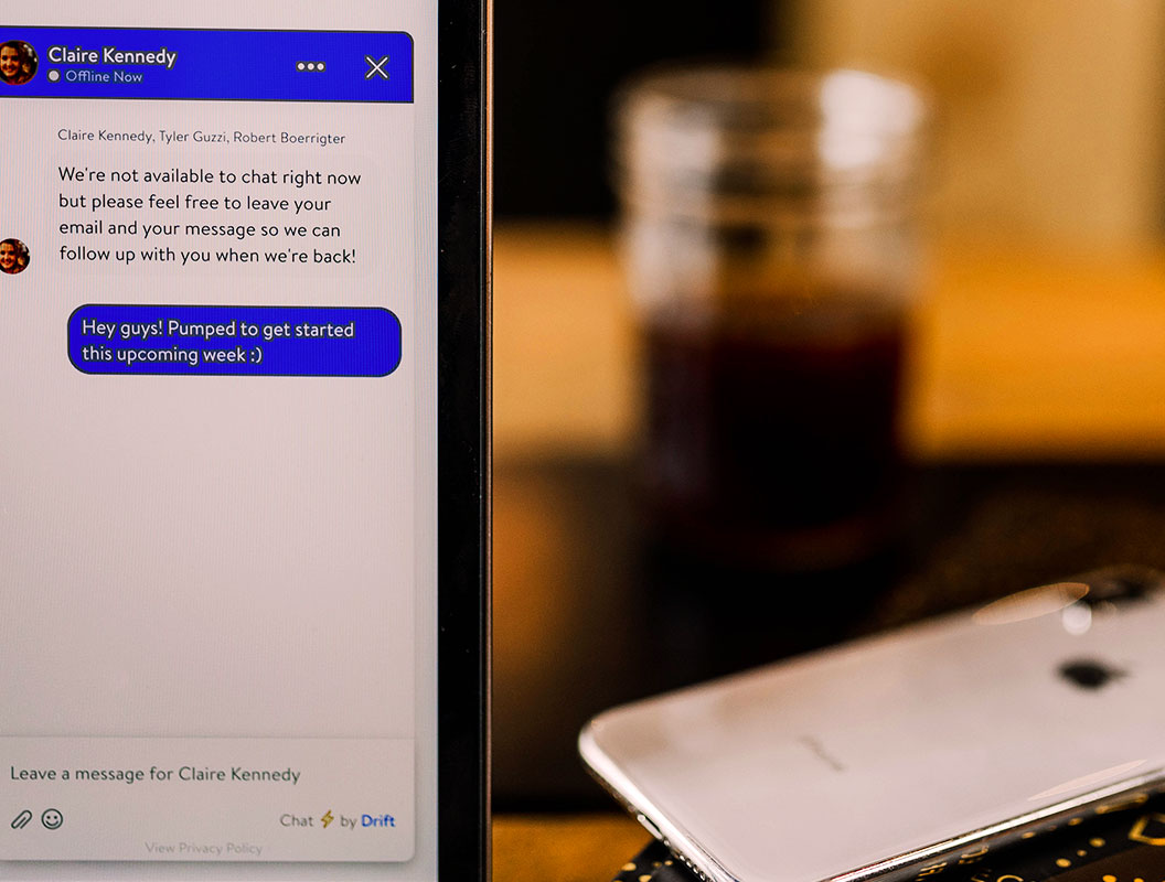
In addition to making sure your users can quickly and easily get in touch with you, a live chat feature will absolutely increase engagement. Live chat improves your customer service. It will also make your website look and feel more professional. Live chat offers real-time convenience for your users and increases your efficiency. Having that type of competitive advantage is crucial to your overall success.
Many businesses have found that a live chat feature also increases conversions and sales, especially when it comes to e-commerce websites. There are plenty of studies that prove just how effective live chat can be, showing that it has an overwhelmingly positive effect on conversion rates. They create a positive experience by allowing you to guide your customers through any questions or concerns they have in real-time. This effectively increases user confidence. Live chat, therefore, leads your users to spend more time and money investing in you and the services you offer.
For more tips to increase user engagement for your e-commerce business, make sure to check out our article that covers the top 7 tips and tricks for a successful e-commerce website. This will help you avoid missing out on conversions and ensures you’re properly equipped to provide a better overall experience for your users.
32. Use Site Search and Make It Helpful
A significant number of website viewers use on-site search to help navigate your site and get what they need quickly. The good news is that these users are more likely to make purchases or convert. Still, you’ll need to invest in adding the site search feature to your website.
Work with your web design team to ensure you’re using the right search terms and serving your users relevant results. Account for misspellings by giving suggestions and enabling some level of fault tolerance with your search option. You can use a “did you mean” feature to easily clear up errors.
You should also ensure that you deliver direct and exact results. Don’t display all match criteria because it can become overwhelming. Instead, give users a way to filter down what they need and find exactly what they’re looking for. Too many choices gets overwhelming and often directs users away from your website.
33. Analyze for 404s
Although soft 404 errors don’t impact your SEO results significantly, they can be frustrating to your users. When a user clicks on a link or image, they expect it to work. If it doesn’t bring them where they want to go, they can easily navigate away from your website and toward your competitors.
Ultimately, 404 errors pages are annoying. They also slow down page loading speed and disrupt the sales funnel and user journey. You can use Google Webmaster tools to check your website for crawl errors. A professional website hosting company will also perform a periodic site analysis to check for these errors. At BragDeal, we offer maintenance packages that include these services. We’ll quickly and effectively address any 404 errors to ensure your user satisfaction.
Wrapping Up

When it comes down to it, providing the best website user experience for your customers is all about putting your website visitors first. Making sure they have everything they need to understand your brand and the products and services you offer is crucial. This also proves that you have what it takes to provide them with a professional and personalized experience.
BragDeal is a leading web design agency in Vancouver and we are one of the top web design companies in Canada. We offer a wealth of experience and look forward to putting our professional web development skills to work for you. Following the steps outlined above, you can make sure that your website is the best that it can be.


