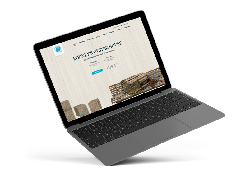
WEBSITE OVERVIEW
Restaurant Web Design
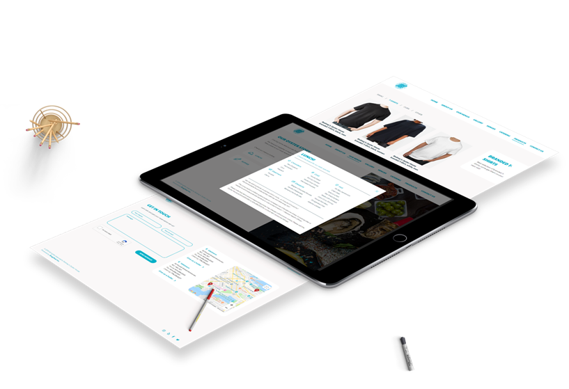
A sea food restaurant requires a website that portrays appetizing menu, aqua themed environment, and great vibes.
When Rodney’s came to us for a website revamp, we’ve established what the main goals were, and started working on a website that has a funky style, unique in its nature, and clearly delivering their message to new potential customers.
ANALYZING THE MARKET
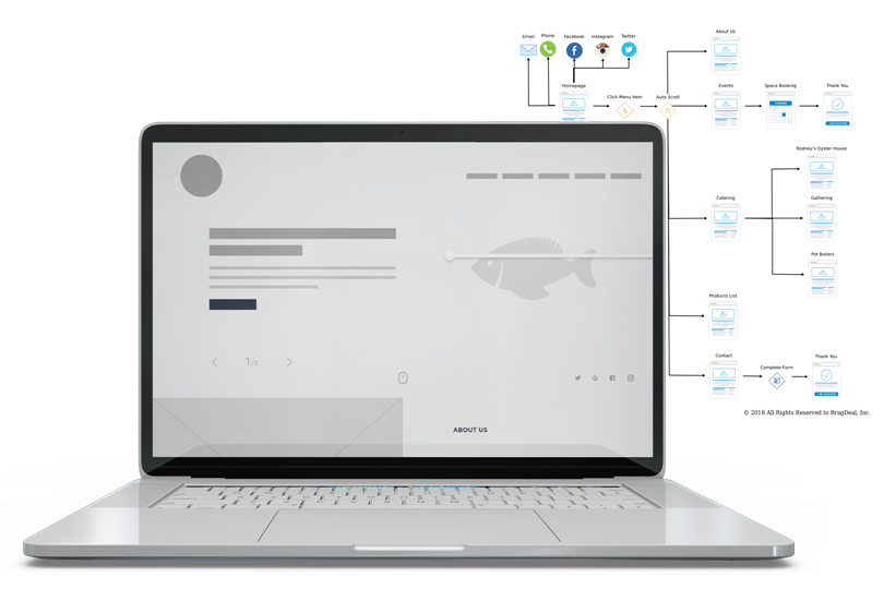
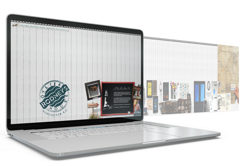
Unique Web Design
We wanted to create something that not following the standard grid of long landing pages. The strategy we went with included page click through, minimal required steps to book a reservation, and a very intuitive browsing experience.
FITS ANY SCREEN SIZE
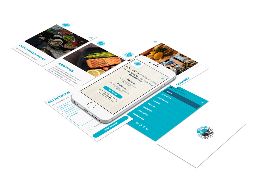
Mobile Responsive Design
Having two restaurants in the center of the busiest areas in the Lower Mainland, it was our top priority to ensure the website operates smoothly on a mobile device.
Most people in the downtown area are attached to their phones. When deciding on a restaurant, it’s almost an instinct to look up a good spot on Google which leads to a website. We wanted to ensure that everyone that lands on Rodney’s website, would 100% make a decision to visit the place.
USER EXPERIENCE
Interactive Web Design
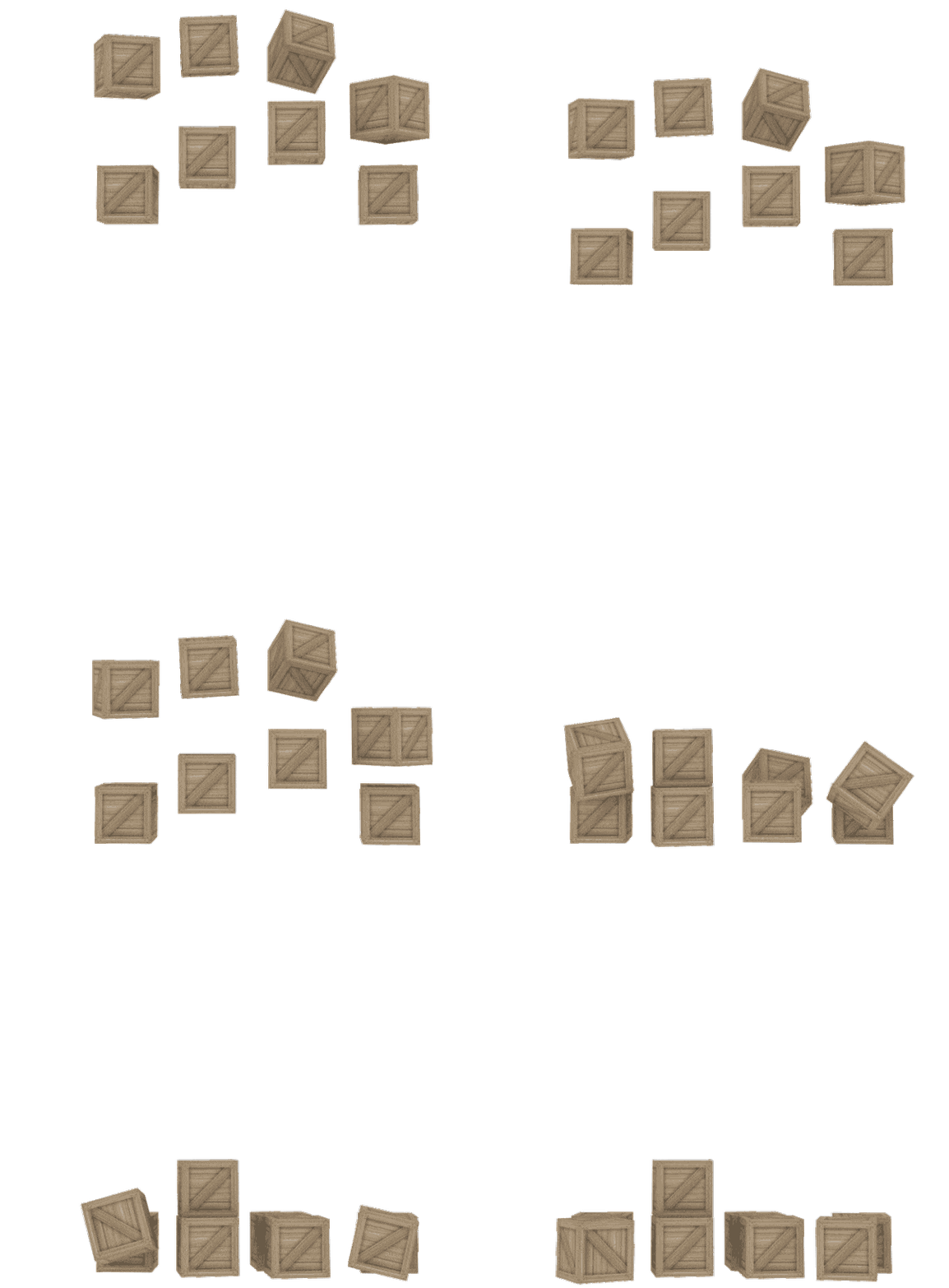
Part of creating a unique sea food restaurant website design meant creating custom elements for specific areas of the site.
We decided to create a 3D animation to illustrate falling boxes. The boxes are meant to portray the sea food storage area, giving the restaurant an authentic sea food vibe.
UX AND UI WEB DESIGN
Website Launch
Each detail on the page mattered. From the loading animation, to the way the page opens up, everything was part of the unique composition. Each time the page loads and the elements slide into place, there is a sense of excitement and curiosity to learn more.
Once the entire site was completed, it was time to do last final tests and launch it to be available publicly!
FONTS USED
TYPOGRAPHY
H1 Stardos Stencil
In order to represent the company’s brand, we’ve selected this font to display the main text of the website. Being the first thing that users will see, it was important to create a specific association to the restaurant’s vibe as soon as the first sentence is read.
H2 Paytone One
Being a very bold font, we’ve selected this one for menu and title items in order to get them to stand out among the images and other content on the website.
p Montserrat
A very modern yet elegant font that flowed well with the website overall theme. We selected this font due to its ease of read and clear typography.
Palette
COLORS
PRIMARY
SECONDARY

RESULTS
Achievements
We have taken a website that had difficult navigation, a large learning curve of how or where to find things, an old school approach, and gave it a full face lift.
Traffic Increase
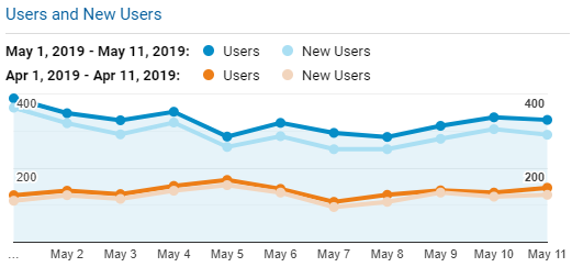
One of the major focuses was to get more customers to visit the restaurant. By doing proper research on the target audience and analyzing the competitors, we were able to create a website that draws attention.
More Intuitive
Users should not have to learn how to use your site as most of them won’t. The new revamped website we’ve created for Rodney’s is now a much cleaner layout that allows users to find what they need.
This major website layout adjustment has removed over half of the bounce rate rating which is a very good thing. On average, anything less than 50% is considered an engaging website. What this means is that users come to the page and actually stay around longer, browsing around the site rather than leave right away.

Organized Structure
Aside from redesigning the frontend look, we’ve also focused on ensuring the backend is well organized. Search engines value it, load time is improved, and the admin have an easier time navigating around and making changes as needed.
By complying with search engine requirements, we’ve doubled the organic search results.


