PROGRESS
Project Summary
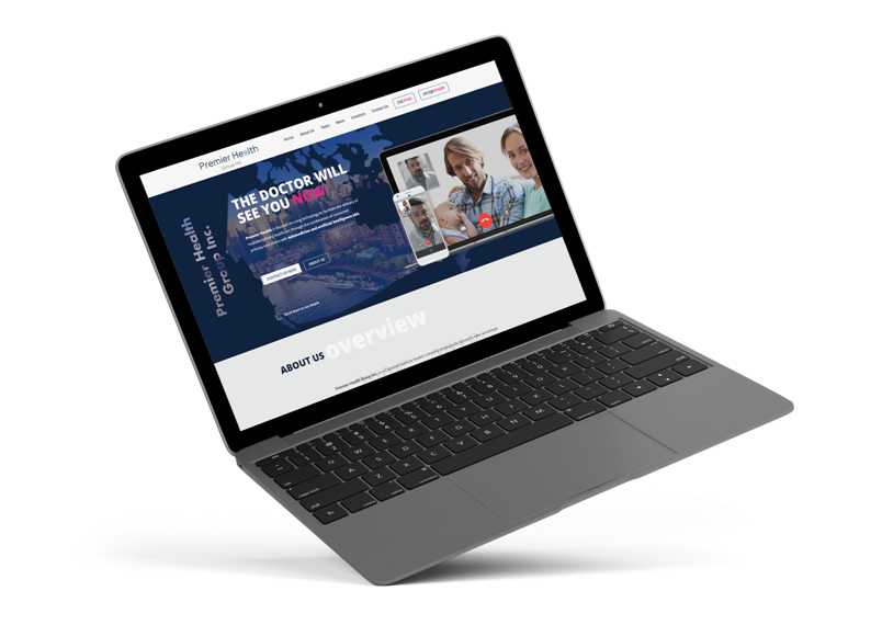
Creating a high end website to provide great user experience is one thing, convincing investors to invest in the business is completely another ball park!
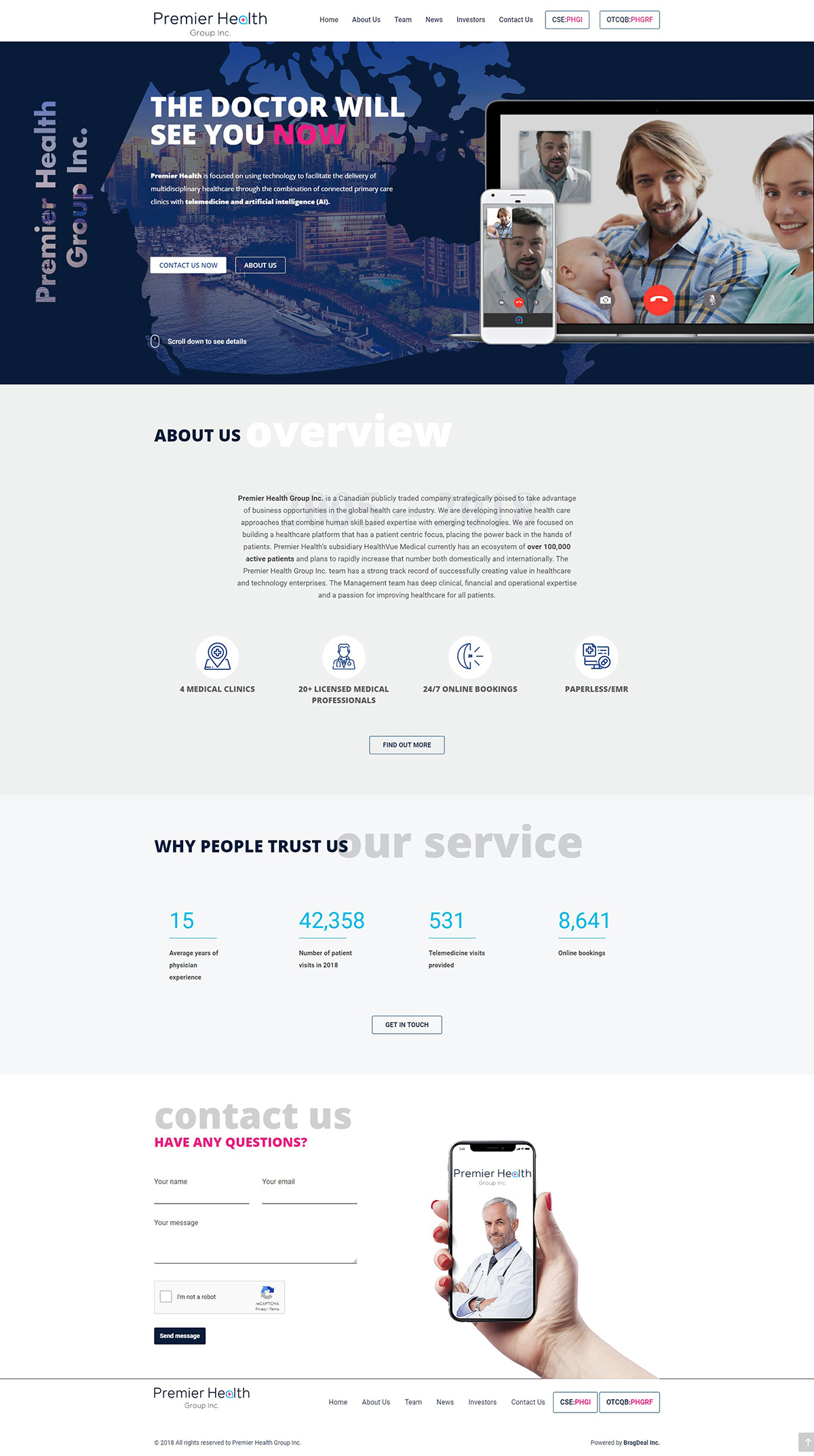
Being a publicly traded company, Premier Health Group needed a website that portrays credibility, trust, and provides all the required information for investors to make a decision to pull the trigger.
FIRST STEP
Discovery & Strategy
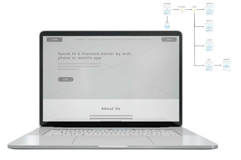
After analyzing the market, target audience, and competitors with similar type websites, we began forming the structure that would be intuitive to navigate, but more importantly, get investors to the area that we wanted them to get to.
Once there, we needed to present clear call to action buttons so that conversions were taking place.
WEBSITE DEVELOPMENT
Putting it all together
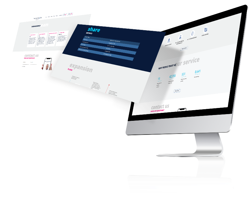
Once we finalized the concept, studied the ideal colour combinations, and locked in on several different fonts, we began the graphics stage. Piece by piece we added a live feeling to the approved wireframe.
Ensuring that the backend code was compliant with search engine requirements, we developed a website that had a seamless dynamic communication with the frontend.
FINISH
Delivery
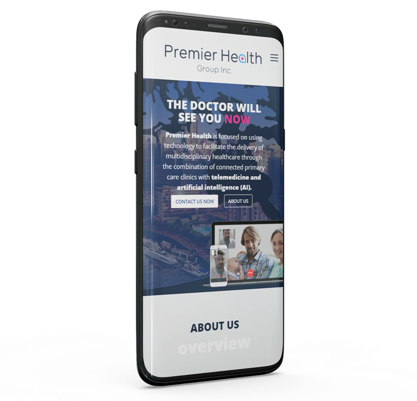
We understand that most people use their phones for almost everything. Ensuring that Premier Health Group’s website perfectly fit a mobile device was a priority.
Investors that came to their site from a mobile device, should experience a very easy to navigate design, even on a smaller screen.
BRANDING
Branding Strategy
During the discovery phase, one of the most important aspects of the project was the brand design. This would be what everything went off of.
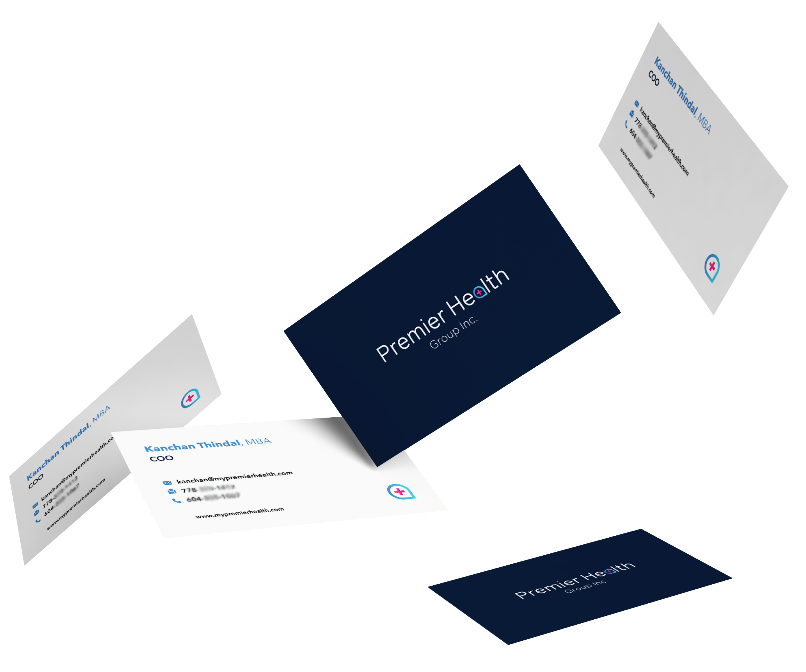
We created Premier Health Group’s logo by understanding their goals, selecting the right colours and fonts that would cater to their target audience, and formed a unique symbol that was integrated in the words. That symbol is now used as an identifying symbol for the brand.
Marketing Material
Get attention
Once the company started to grow, news came out, and trade shows started, it was time to get the rest of the marketing designs done.
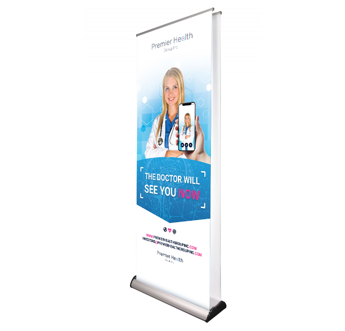
We wanted to create a banner that will make people stop and read it. Utilizing the brand’s colours, fonts, and messaging, we designed a large banner that attracted interested investors to the booth and ask questions.
FONTS USED
TYPOGRAPHY
H1 Roboto
Roboto is a font made by Google to be part of the Android operating system. Google developed this font with a modern approach and followed the Sans-serif typeface family style.
P Open Sans Family
Open Sans is from the sans-serif typeface family that was designed by Steve Matteson. It is one of the trendy fonts that is used across a wide spread on websites. The font’s highly legible style allows readers have an easy time on smaller screen sizes.
Palette
COLORS
PRIMARY
SECONDARY
RESULTS
Achievements
As a growing company, Premier Health Group Inc. needed a website to bring in investors on board. We’ve developed a website that portrays trust and credibility so that investors feel more comfortable pulling the trigger.

We understand that being found is the first step to grow the traffic coming to the website. Our first priority was to organize the backend structure in a way that is compliant with search engine requirements. The results have shown almost a double amount of traffic, month to month.

Steady growth
Monitoring month to month, we are noticing an increase in the users visiting the “Investors” page. That means 288 people checked out information about the company in order to make an investment decision.
Let’s do the math
Following month, an increase of 4.86% in traffic checking out the same page. Out of the 302 people that checked out the investors page in the month of January 2019, even if 10% became an active investor, that’s 30 new investors.
Now we don’t know what investments were made – that’s just information we don’t have, but assuming a minimum of $1,000 per investment, that’s $30,000 extra invested at the minimum.


