PROGRESS
Project Summary
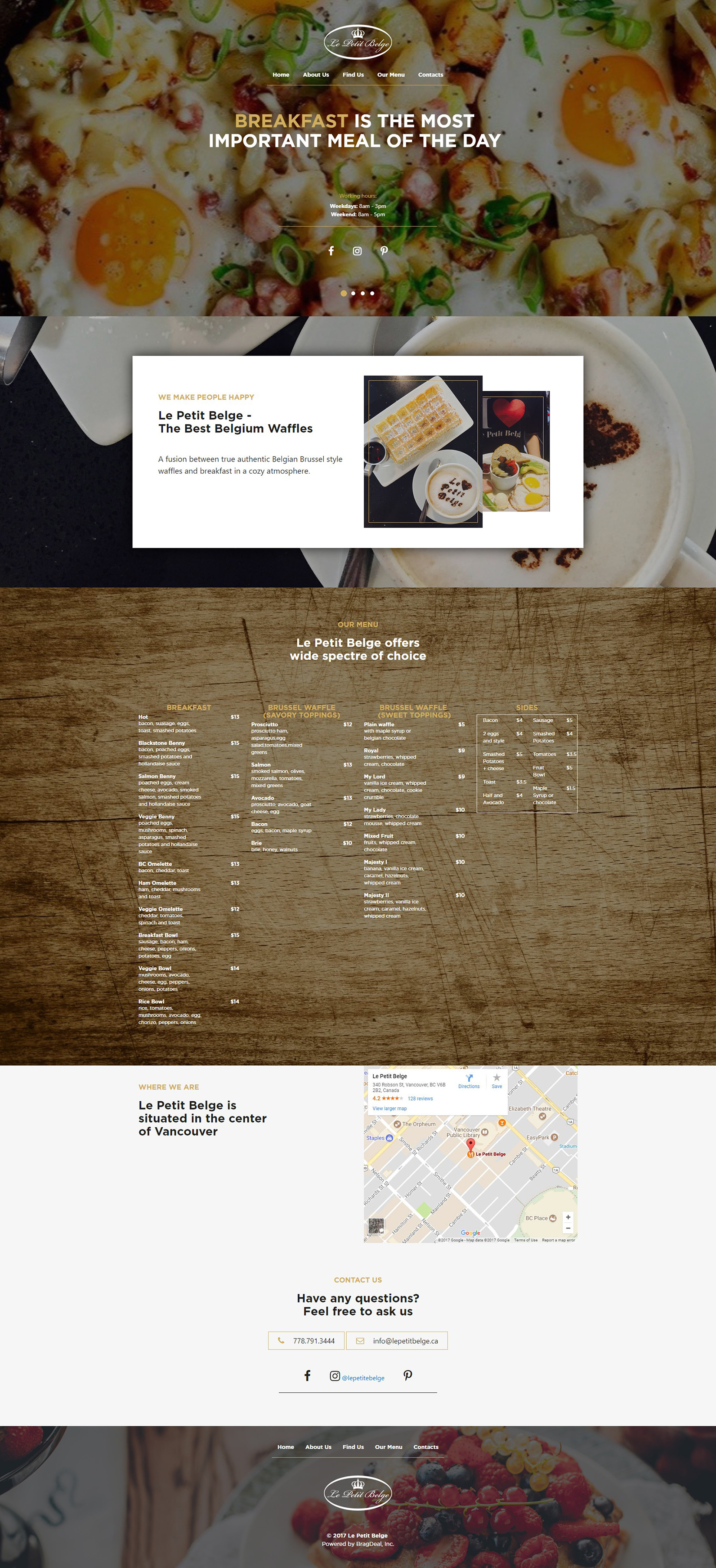
The first step in creating Le Petit Belge’s website was to understand the type of audience they have. Not just people that look for restaurants and want to see the menu, but specifically breakfast lovers, foodies, people that would like to explore tasty new food.
We knew that whoever lands on the restaurant web design would look for a few things, something that will scratch their appetite itch with large visual breakfast food, and a clear and simple menu to pick from.
WEBSITE DESIGN
Strategy & Planning
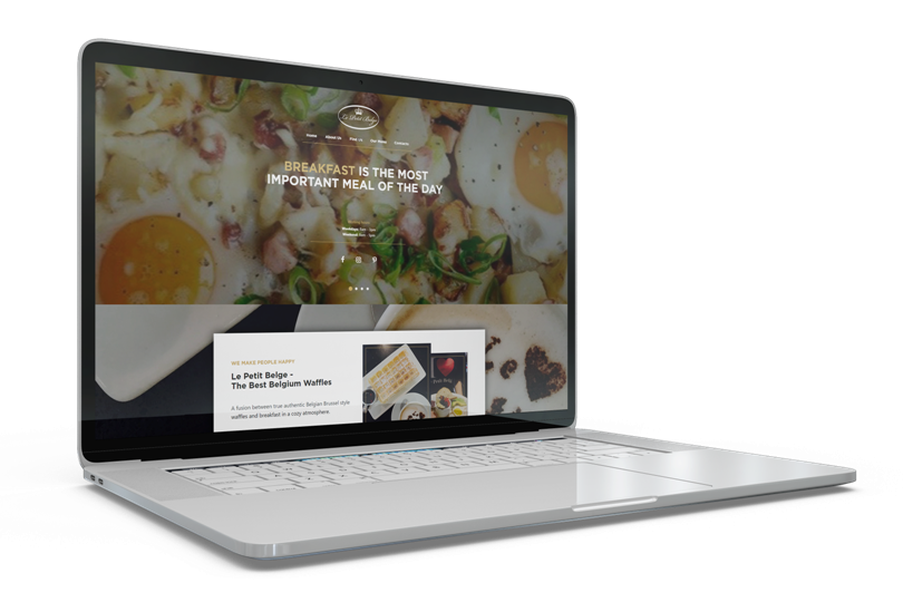
Since the website is all about delicious food, rather than talk about it and try to convince the visitors why it’s worth trying, we went with the “show, don’t tell” method. Large images, edge to edge, focused towards making the users understand what the restaurant specializes in without reading a single word.
As the website visitors scroll through the page, everything is organized in a clean and organized manner so that all the information they need is provided to them within a few scrolls.
ADJUSTABLE LAYOUT
Mobile Responsive Design
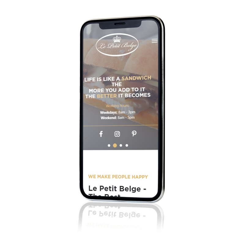
From our research, most customers use their phone to find a new restaurant either while walking around town or while planning with their friends.
Making the website mobile friendly was one of the key priorities. Allowing users to easily go though the site and make their way to the restaurant means more happy customers and an increase of business for Le Petit Belge!
GRAPHIC DESIGN
Breakfast Menu Design
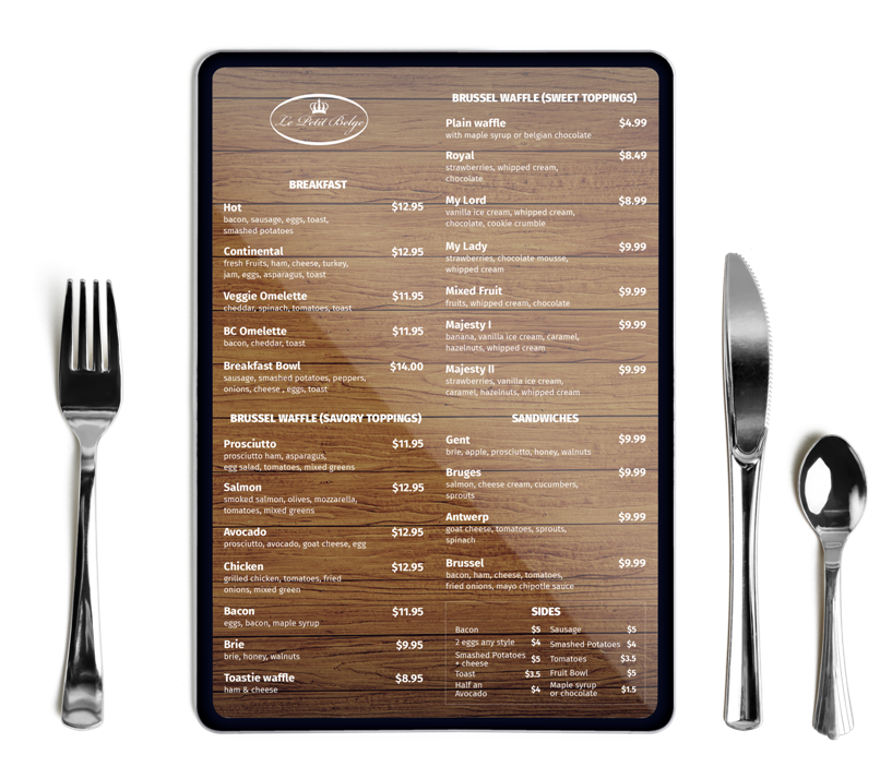
What is the first thing we look at when we are at a restaurant? The menu of course. Aside from the food option, the presentation of the menu makes a huge difference.
How it looks in feels in your hands can pass on the vibe of the place itself, what sort of food quality to expect, the customer service that comes with it, etc.
FONTS USED
TYPOGRAPHY
ALL Gotha Pro
Being a very sharp font type, we picked it as it’s bold, clear, and easy to read. It fit well with the website look and feel, and allowed for consistent aligning with images and other blocks of text.
a System UI
This font was created as a default font for Macintosh users. It’s a simple, round, and well spaced out font which allows for an easy read.
We chose to use this specific font for the phone number and email so that these stood out as well as made to be visually very easy to find.
Palette
COLORS
PRIMARY
RESULTS
Achievements
From no online presence at all to a 24/7 operating website and social media that provide users with information about the restaurant. Now users can view information about the menu items, a gallery of delicious looking food, and get directions to the spot.

