
PROGRESS
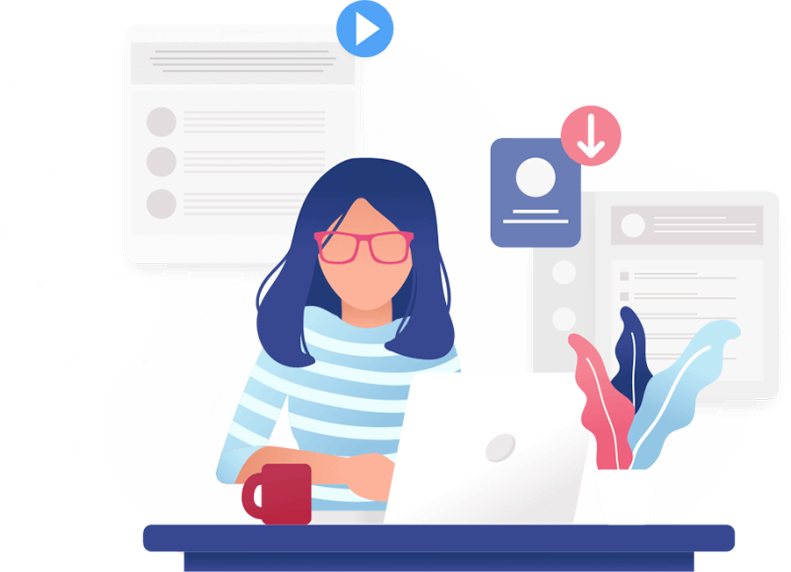
Project Summary
Working closely with I-MED Pharma, our web design team set out to overhaul their online presence. They had two separate sites—a plain info site and a cluttered e-commerce one—causing confusion for users. Our goal? Create a single, seamless hub for both doctors and patients. We tackled outdated looks, messy navigation, and countless small annoyances.
We streamlined everything, making it easy for everyone to find what they need, fast. This project wasn’t just about aesthetics; it was about making healthcare tech accessible and hassle-free. And that’s exactly what we delivered—a digital platform that reflects I-MED Pharma’s dedication to top-notch user experience.
USER FOCUSED DESIGN
Dynamic User Experience
To deliver a highly personalized interface, maximizing relevance and usability, we introduced the “I’m a doctor” or “I’m a patient” selection on the products page. This empowers users to choose their journey, ensuring they only encounter products pertinent to their needs. Moreover, dynamic backend settings enable comprehensive customizations, including pricing adjustments and product visibility, offering administrators full control over the platform’s functionality.

BACKEND CUSTOMIZATION
Enhanced E-Commerce Website
The new website features a dynamic product categorization system that intelligently shows or hides categories, as well as products, based on the user’s type and login status. Whether you’re a doctor or a patient, logged in or browsing as a guest, you’ll encounter a tailored selection of categories that align with your specific needs and preferences. This adaptive approach ensures a seamless and intuitive browsing experience for every user, optimizing their journey and streamlining access to relevant products.


TWO IN ONE SOLUTION
Before & After
The old informational site was cluttered with too many buttons and a long navigation menu, making it hard to find specific information. Similarly, the product site was overloaded with pages, lacking simplicity. By combining the two, we created a single, user-friendly platform. Now, users can easily access both information and products without hassle, thanks to streamlined navigation and intuitive design.
MOBILE RESPONSIVE DESIGN
Fits Any Device
Our Healthcare Web Design project ensured seamless user experience across all devices through mobile-responsive design. Whether accessed on desktop, tablet, or smartphone, the platform offers optimal functionality and accessibility, catering to users’ diverse preferences and needs.

FONTS USED
TYPOGRAPHY
H2 Lato
We opted for the Lato font for its excellent readability, modern appearance, and versatility across different types of content on the site.
P Roboto
We integrated Roboto as a font for all other text on the site due to its crisp and clean design, providing a consistent and cohesive visual identity throughout the platform while maintaining readability and professionalism.
Palette
COLORS
PRIMARY
SECONDARY

RESULTS
Achievements
Our project with I-MED Pharma exemplifies the success of healthcare web design, where we seamlessly merged two separate websites into one cohesive platform. By addressing challenges such as outdated aesthetics and disorganized navigation, we created a user-friendly experience for both doctors and patients. Through personalized product categorization and user-specific settings, we ensured that the platform catered to individual needs, reflecting I-MED Pharma’s commitment to excellence in healthcare technology.