

PROGRESS
Project Summary
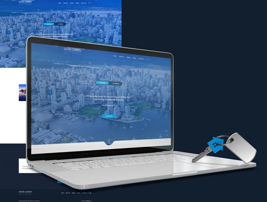
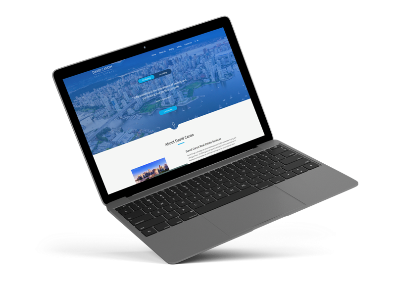
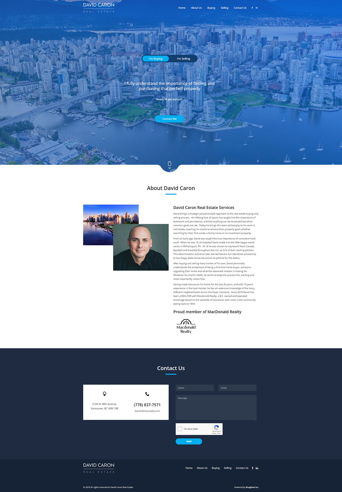
David came to us for a fresh new brand design and a fully revamped website look for his real estate business. He wanted something modern, sleek, and classy. Finding the balance between David’s vision and a touch of our creativity was one of the main parts of the project.
From colour and typography choice for the branding, to structure and layout of the website design, the project entailed in various sketches and iterations until we got it right.
FIRST STEP
Strategy & Planning
Being a professional, David wants to portray a sense of credibility, trust, and a high level real estate agent services. David deals with many clients that are in a rush to find a new place to either live or invest in. This means that those clients must be able to access the website in Vancouver to find information about him quickly and easily.
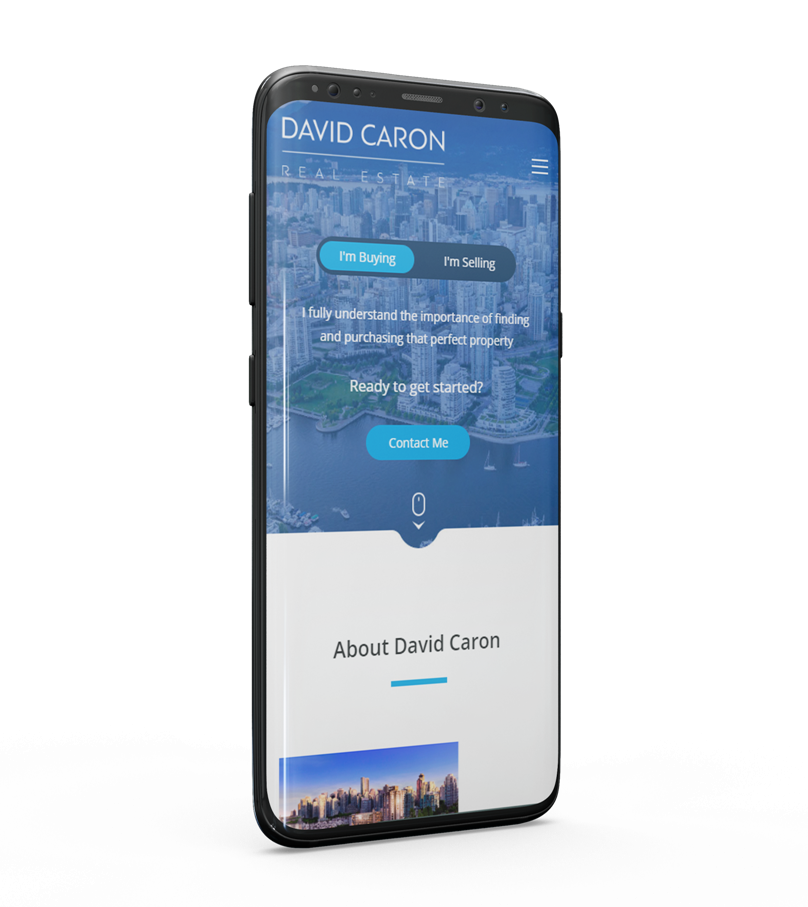
We ensured to plan the structure of the website design in a way that makes the mobile view experience intuitive and user friendly, yet maintains a unique website design feel.
RESPONSIVE WEB DESIGN
Fits All Screen Sizes
Most of the real estate buyers and sellers are constantly on the move between open houses and calls with their realtor just to name a few things during the stressful / exciting times.
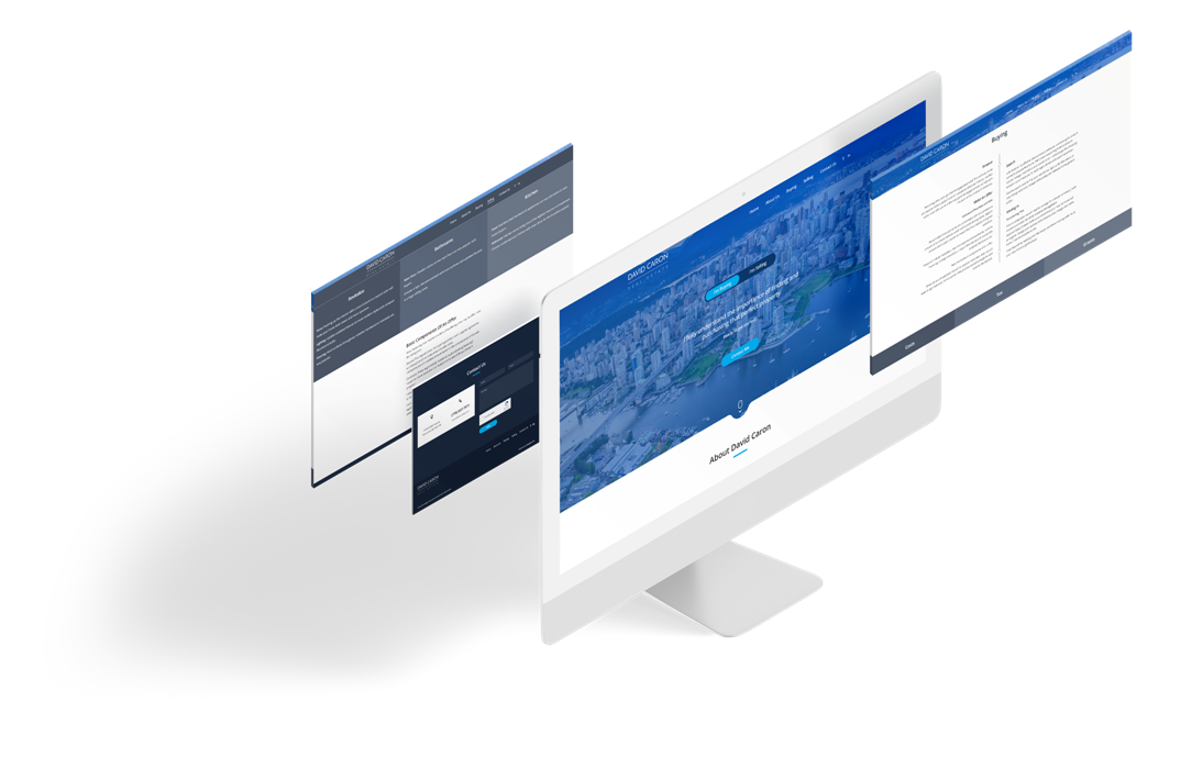
An important aspect of David’s website was ensuring that it fit perfectly on any screen size, and provided the best user experience. By structuring the real estate website design in a block by block format, it allows for easy scroll through navigation and helps navigate users to get in touch.
LOGO DESIGN VANCOUVER
The Design Process
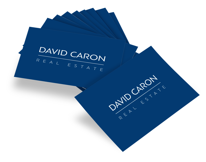
Creating a logo design for David Caron’s brand made us really think outside the box. Real estate in Vancouver is a very competitive niche, coming up with something that has not been done before required analyzing, researching, and triple checking to make sure our concept was the only one of its kind.
The process of the logo design required multiple sketches and iterations to be done until a presentable concept was chosen.

BRANDING
Branding Strategy
Being a professional, David wants to portray a sense of credibility, trust, and a high level real estate agent services. David deals with many clients that are in a rush to find a new place to either live or invest in. This means that those clients must be able to access the website in Vancouver to find information about him quickly and easily.
We ensured to plan the structure of the website design in a way that makes the mobile view experience intuitive and user friendly, yet maintains a unique website design feel.
FONTS USED
TYPOGRAPHY
H1 Open Sans
Open Sans is from the sans-serif typeface family that was designed by Steve Matteson. It is one of the trendy fonts that is used across a wide spread on websites. The font’s highly legible style allows readers have an easy time on smaller screen sizes.
Palette
COLORS
PRIMARY
SECONDARY
RESULTS
Achievements
Creating a modern website for David meant a huge credibility boost for all his new potential clients. Being David’s client ourselves at some point, we knew what to look for and how to improve the website’s look and feel to help convert more visitors to warm leads.