PROGRESS
Project Summary
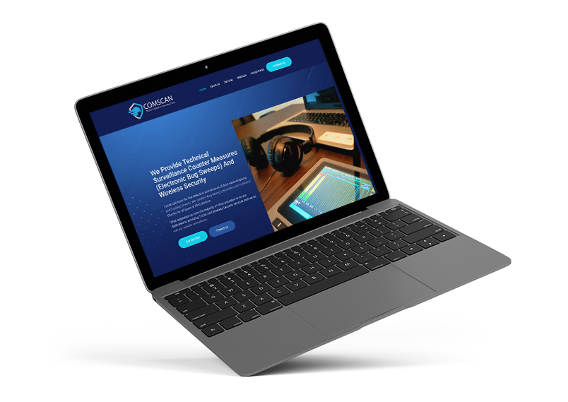
As a growing security company, COM-SCAN needed a logo as the face of the brand, as well as an informational security website that will help educate future potential customers about the company’s services. Following our client’s requirement, we had to create a brand and website that were professional, memorable, and help customers make a decision to inquire about the services.
THEME WEBSITE SETUP
Strategy & Planning
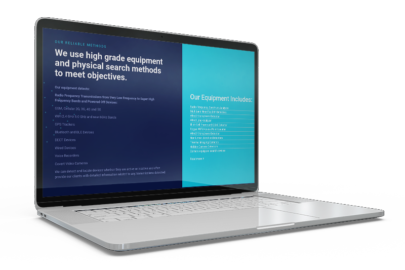
We began our research for themes that were relevant to the security field. While keeping in mind the target audience of the company, our main goal was to create a website that’s neat, simple to navigate, and informative. The main objective was to educate users about the services and help them get in touch.
BRAND RESEARCH
Logo and Business Card Design
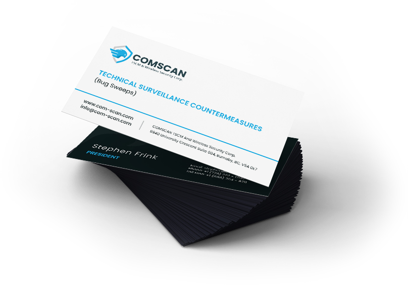
Combining the messaging and the requirements that were provided, the new security company logo design became the official brand representation. We tried to avoid cliché or overused symbols while maintaining the professional, secure, shield look as that fits well with the security industry.
PRINT READY GRAPHICS
Flyer Design
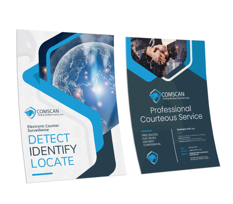
Whether it’s for a tradeshow, mailout to potential customers, or simply laying at the office reception desk for anyone to grab, the flyers we designed intended to grab attention.
One of the main focuses was to maintain a uniform design with the overall brand while covering all the key points about the business.
MARKETING MATERIAL
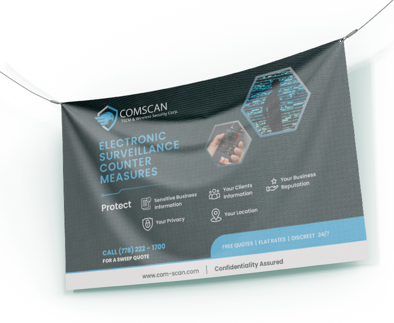
Banner Design
What’s a better way to get attention than a large banner advertising your business!? We wanted to capture COM-SCAN’s brand message in a quick snapshot so that whoever looked at it, would stop and go through the details. The goal was to help increase the likely-hood of getting a new customer calling with a clean and simple banner design.
FONTS USED
TYPOGRAPHY
H2 Open Sans
We chose Open Sans as it has clear cut and bold font style which fit well for the titles, providing a stark contrast between sections.
nav Poppins
For the security web design style of the homepage, a font that was both stylish and easily readable was chosen to ensure seamless navigation.
Palette
COLORS
PRIMARY
SECONDARY

RESULTS
Achievements
The main goal of the project was to develop a new brand that would attract the attention of potential new customers. A security web development was also required to go along with the brand. The results of our work were a brand that the client could proudly use to represent their services. As well, we delivered a professional website that helps customers get all the information they might be after before reaching out.

