PROGRESS
Project Summary
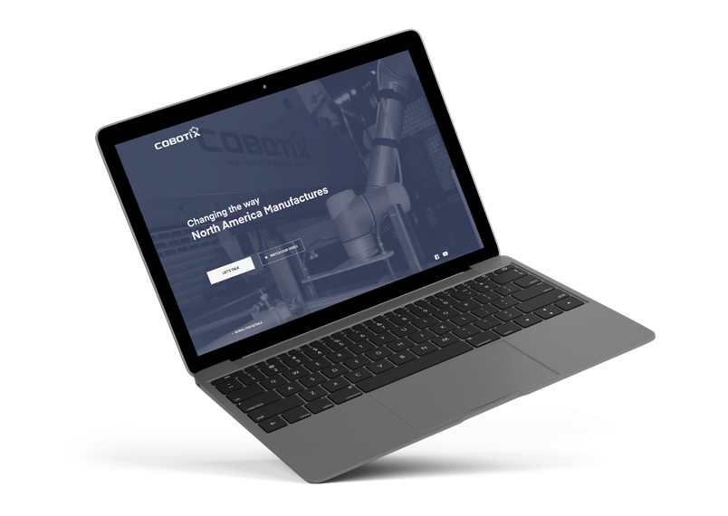
Cobotix’s old website needed a major revamp for a modern new look. In order to appeal to higher end prospects, we planned out a web design structure that followed a grid, was simplistic, and guided users throughout the pages.
Web Design Discovery
Website Development Strategy
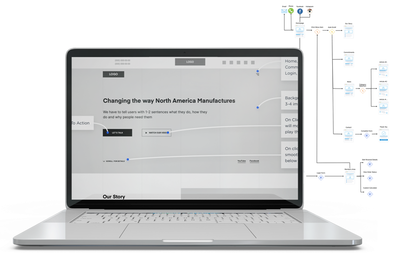
We began by analyzing the company’s direction, review what the competitors were doing and what worked for them, and created user personas that would be the ideal user visiting the website.
Once we had all the data collected, we began the sitemap planning and worked on the site flow composition to help guide the rest of the project.

Responsive Web Design
Mobile Friendly
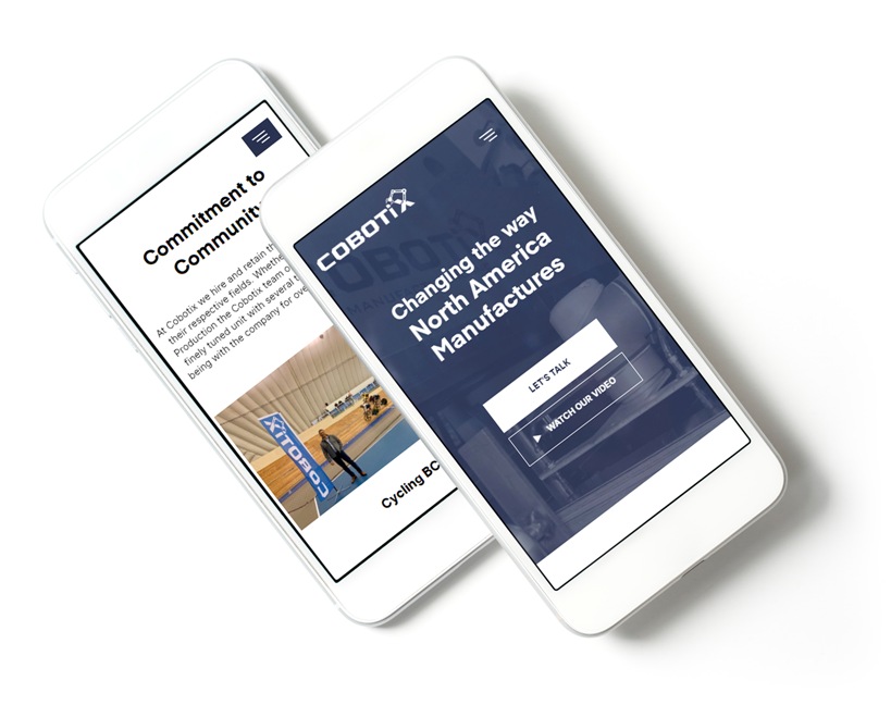
During the graphic design stage, we made sure to follow the wireframe for both the website design on a desktop and mobile view version.
Ensuring the ability to switch between devices and have the same user experience was an important aspect to the website development.

Website Effects
Simple, Clean, Modern
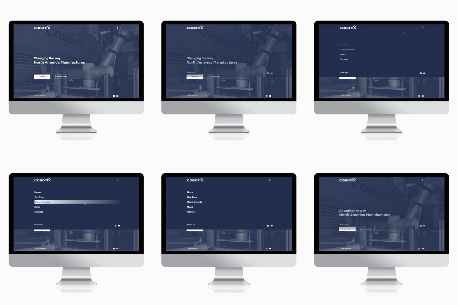
We wanted to create a user experience that was intuitive yet memorable. Every click, every scroll, and every page load had to provide a certain feeling. For example, the satisfying effect from a simple menu appearing on click and going away on another click was just a subtle yet effective way to maintain a minimalist look to the overall manufacturing web design.

FONTS USED
TYPOGRAPHY
H1 Eina
The website has a very organized structure and this font choice went well with the sharp and clear look. Its straight cuts and very obvious lettering flows well with the grid and elements around the page.
p Inter Regular
Easy on the eye yet very clean look, this font helps maintain the modern look and feel while providing a great user experience.
Palette
COLORS
PRIMARY
SECONDARY


