PROGRESS
Project Summary
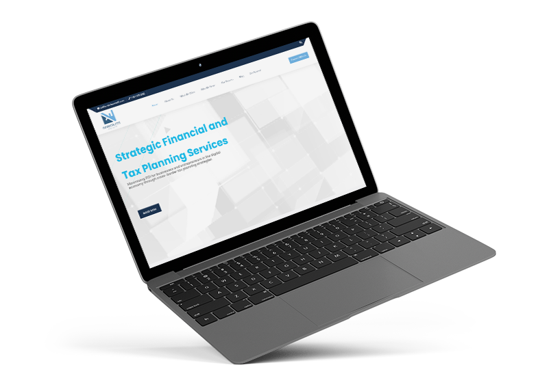
Starting from a simple Wix website, Borderless Wealth was ready for a major revamp. From the look and feel, to the flexibility of the previous site, the brand was growing and required a fresh new website.
The goal of the new website was to provide a better user experience so that users convert into leads. A professional finance website must provide trust association since people’s personal money is on the line.
DISCOVERY STAGE
Strategy & Planning
From researching the target audience, to analyzing the company’s needs, we prepared a plan that would help achieve all the goals. Ensuring the right theme was picked, set up correctly, and achieved the user friendly vibe we were after was the main objective.
Mainly the focus was on how to get a new user to trust the brand so that they decide to inquire about the services.
MOBILE RESPONSIVE WEBSITE
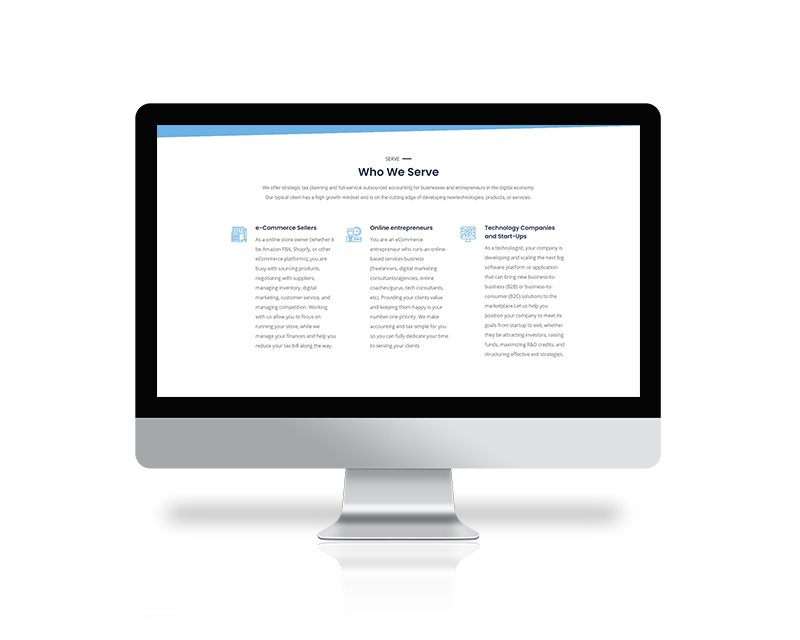
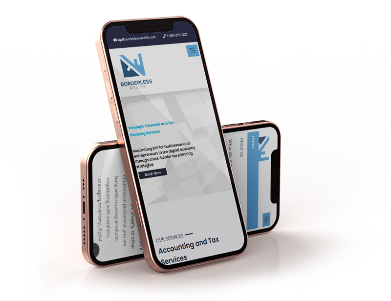
Fits All Screens
Since most of the potential customers are entrepreneurs and constantly on the go, most of them use their phones to browse the web. It was crucial to ensure that the website fully fits within all mobile devices, including tablets.
BRANDING IDEATION PROCESS
Sketching Concepts
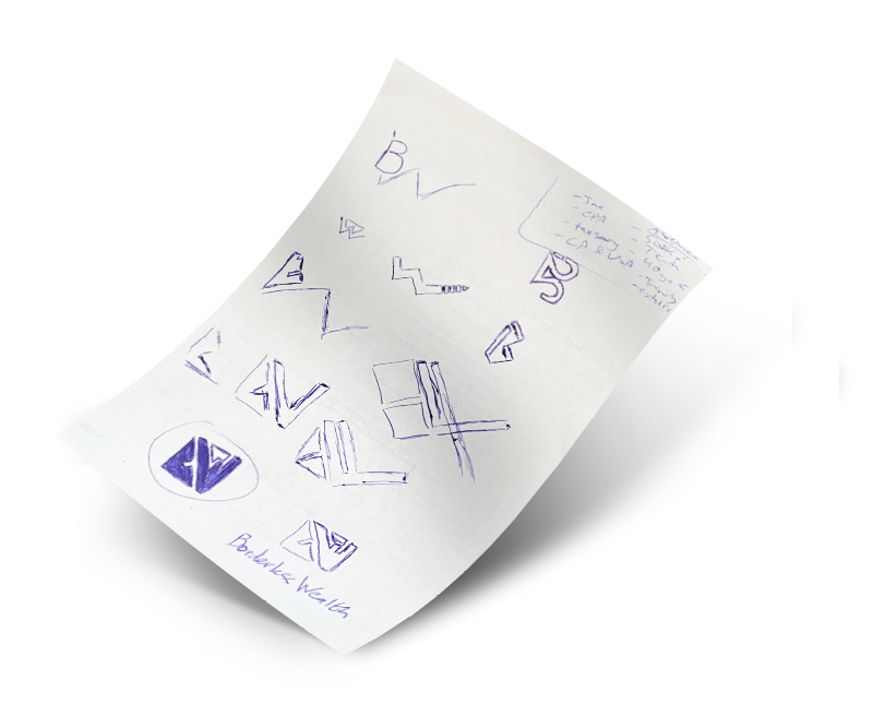
After analyzing all the notes and ideas, the sketching process has begun. Playing with shapes, letters, and spacing, we were aiming at a design that was unique and memorable.
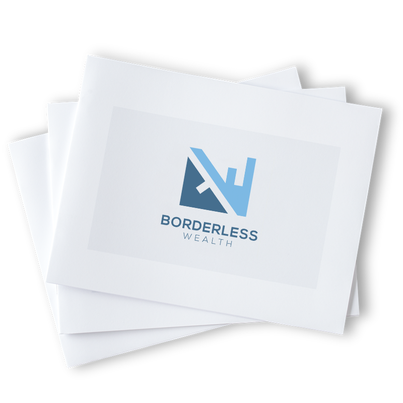
The concept revolved around having a border-less feel while portraying trust. The W leaning on the B represents the ability to lean on someone for help. This idea was meant to symbolize the brand’s core values.
FINANCIAL SERVICES LOGO DESIGN
Final Logo Mockup
The logo concept that was chosen ended up hitting home! The elegance and minimalist look allowed the brand to stay modern, meanwhile carrying a story with it. The chosen colours brought a trust association to help potential customers feel good moving forward and being loyal to the brand.
FONTS USED
TYPOGRAPHY
NAV Open Sans
Open Sans is from the sans-serif typeface family that was designed by Steve Matteson. It is one of the trendy fonts that is used across a wide spread on websites. The font’s highly legible style allows readers have an easy time on smaller screen sizes.
H1 Poppins
For a corporate, easy to read, and clean look, we decided to go with the Poppins font type.
Palette
COLORS
PRIMARY
SECONDARY

RESULTS
Achievements
The website has fully moved over to WordPress, allowing a significantly more features and abilities. As the company grows, the website backend is flexible and ready for any required adjustments.

