
PROGRESS
Project Summary
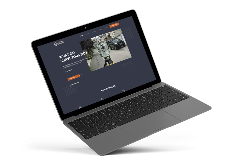
360 Land Surveying came to us when they realized that it’s time to create a uniform brand design, as well as upgrade their old website. They understood that keeping up with the evolving design trends is important not only for aesthetics but also for brand recognition.
We’ve taken their old site and any material they could provide and just like their name, did a 360 makeover to the layout, flow, and graphic design of the entire company.
REVAMP STRUCTURING
Strategy & Planning
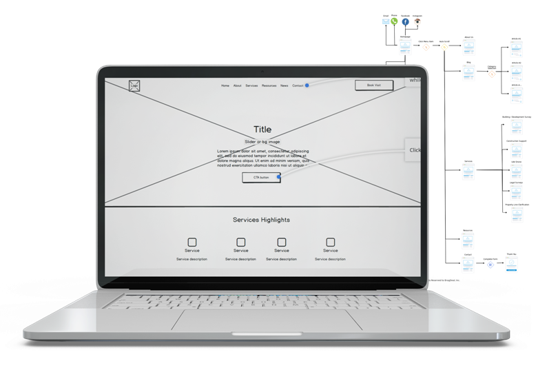
Taking the old site’s content and organizing it into a format that is simple to follow was the main focus. We wanted users to be able to understand what the website is about within 5 seconds or less from the moment they land on the page.
After analyzing all the pages and services, we began reviewing the land surveying competitors, as well as research different sites that had interesting ideas we could get inspirations from.
LAND SURVERYING WEBSITE DESIGN
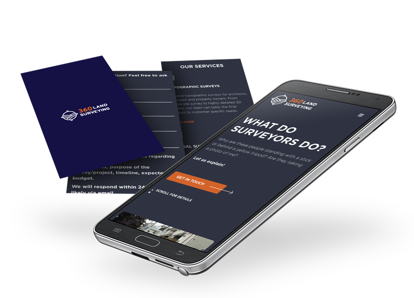
Mobile Friendly Fluid Design
Since the desktop view had a lot of settle animating elements moving around the page, we had to make sure it all dynamically adjusts to any screen size.
Following the standards for a website design on a mobile device, we’ve positioned the elements in a way that makes it easy to scroll through.
COMPLETE WEBSITE RE-DESIGN
Before & After
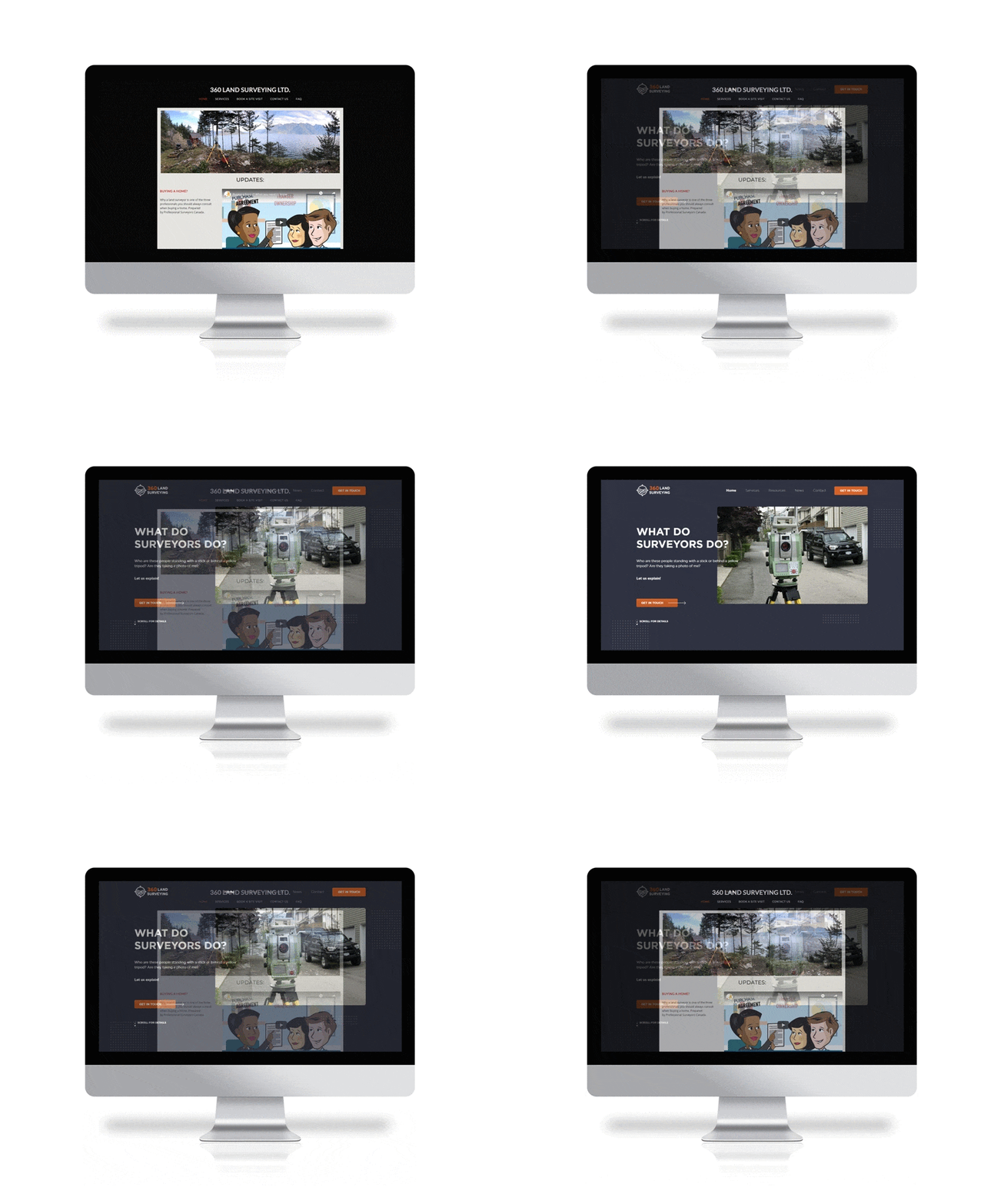
The previous website was purely created for serving information to the viewers. There was lack of design, no clear click-to-action, it wasn’t mobile friendly, and the list goes on.
We’ve analyzed how we can take what was already there, and converted it into a website that gives its users a certain sense of direction. We wanted users to understand the company and make a decision rather than just leave the page.
CONSISTENT BRAND LOOK
Branding Design
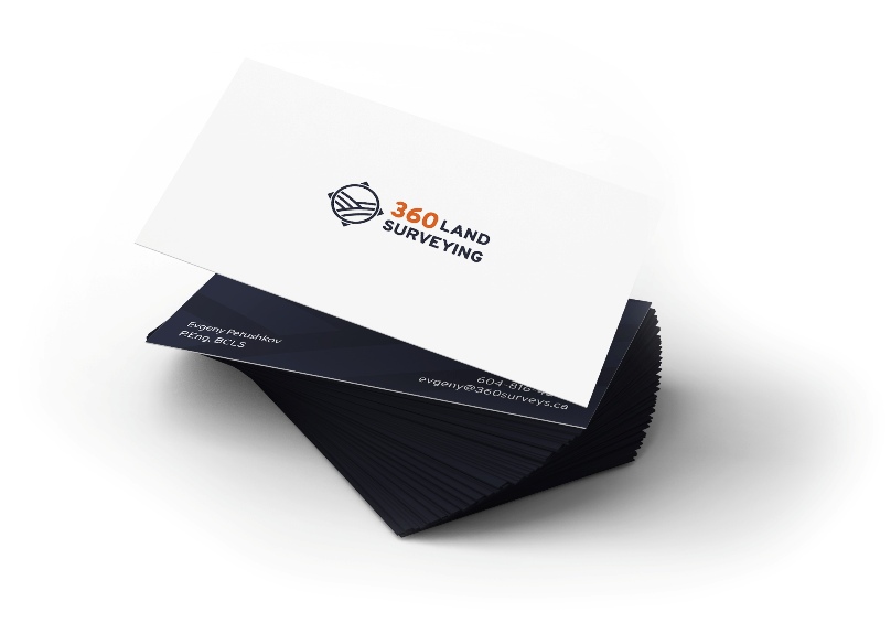
360 Land Surveying wanted to stick with the orange they previously had so we had to figure out a way to combine it with another colour that would provide a sense of comfort for customers.
We chose to go with the dark blue as it provides a trust association for customers, as well as portrays credibility and maturity. We also wanted to maintain sharp lettering as a representation of the precision and accuracy that the company stands by.
FONTS USED
TYPOGRAPHY
H1 Gotham Pro Bold
As a company that works with precision, we wanted to use a font that is very clear and sharp. Our selection of the Gotham Pro font type allowed to combine the company’s messaging with the design.
H2 Gotham Pro Light
In order to keep the consistency in the design and to have an easy flow from section to section, we decided to use the same font type as for the titles, except the thin version rather than bold.
Palette
COLORS
PRIMARY
SECONDARY
RESULTS
Achievements
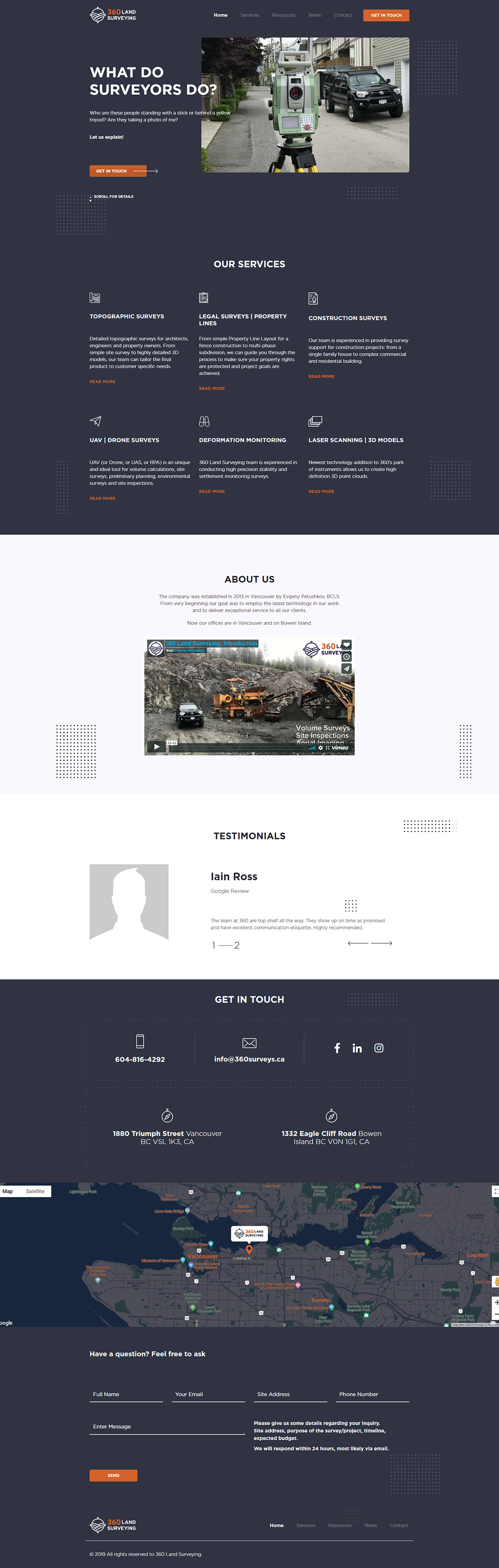
Comparing the old and the new website side by side shows a significant transformation. The brand in general came back to life and joined us at the 21st century!
The branding is all uniform across all the marketing material, the website’s user experience has dramatically improved, and the overall company’s online presence has evolved.